The Challenge
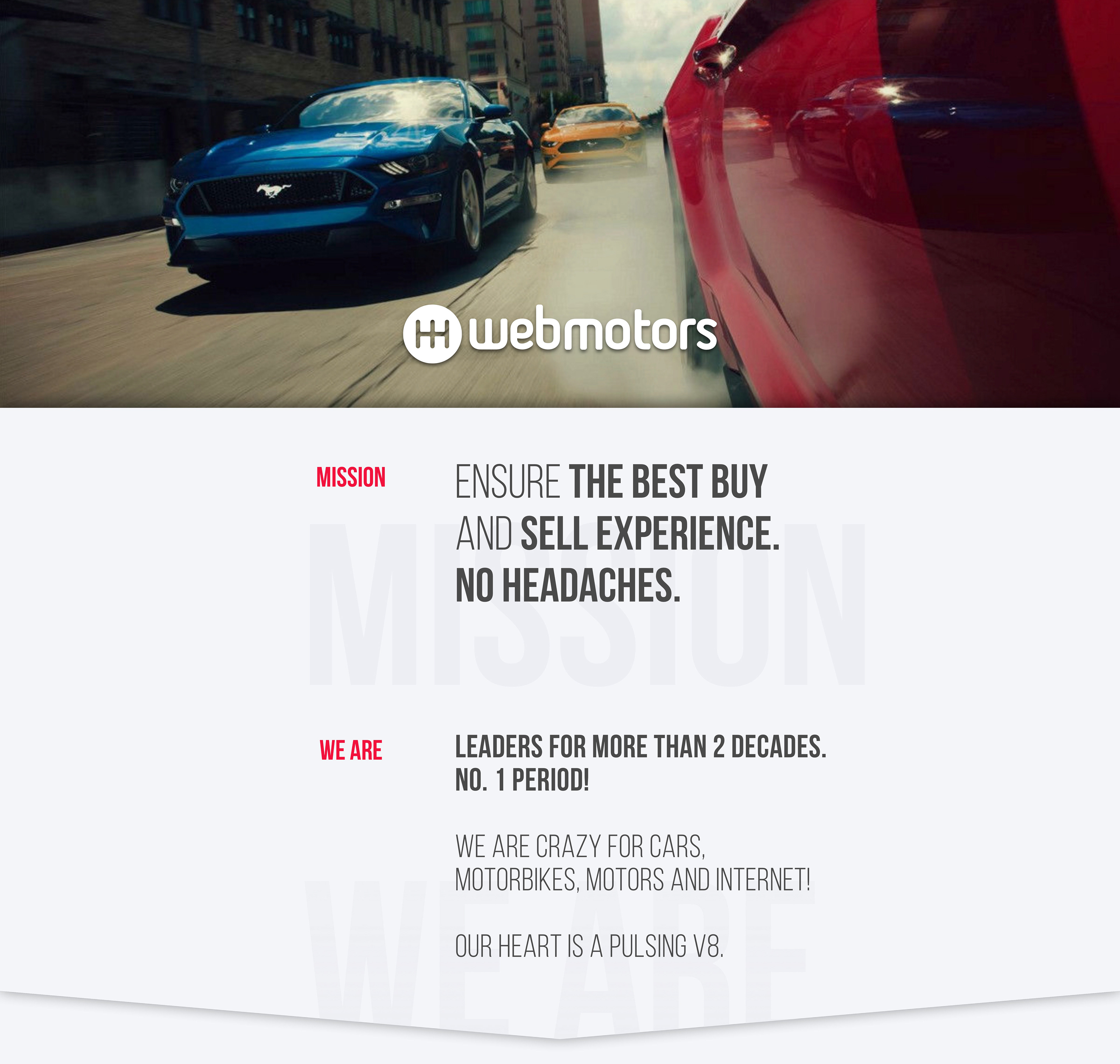
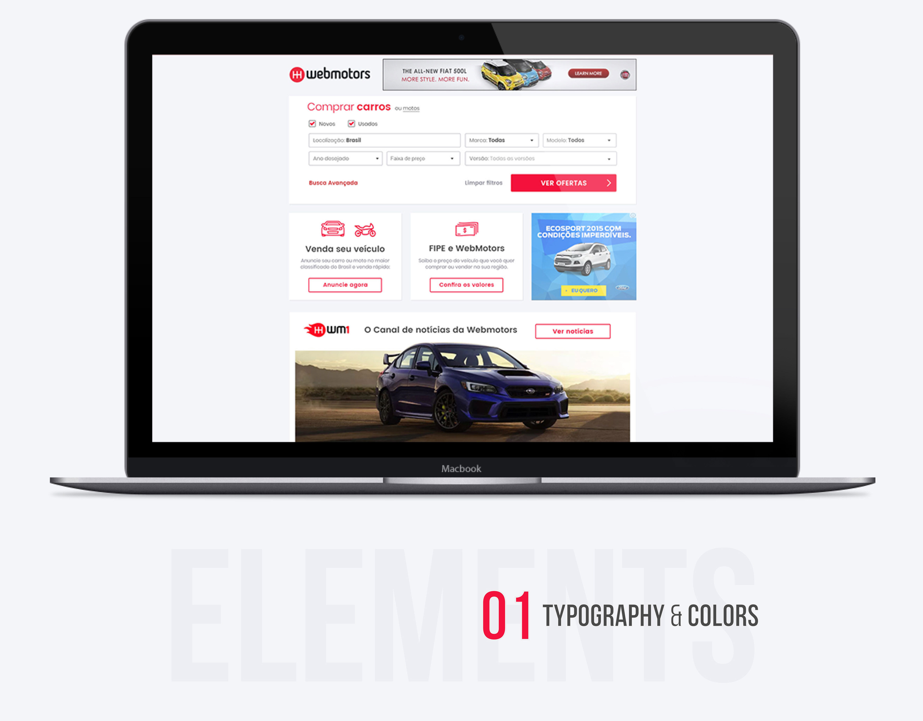
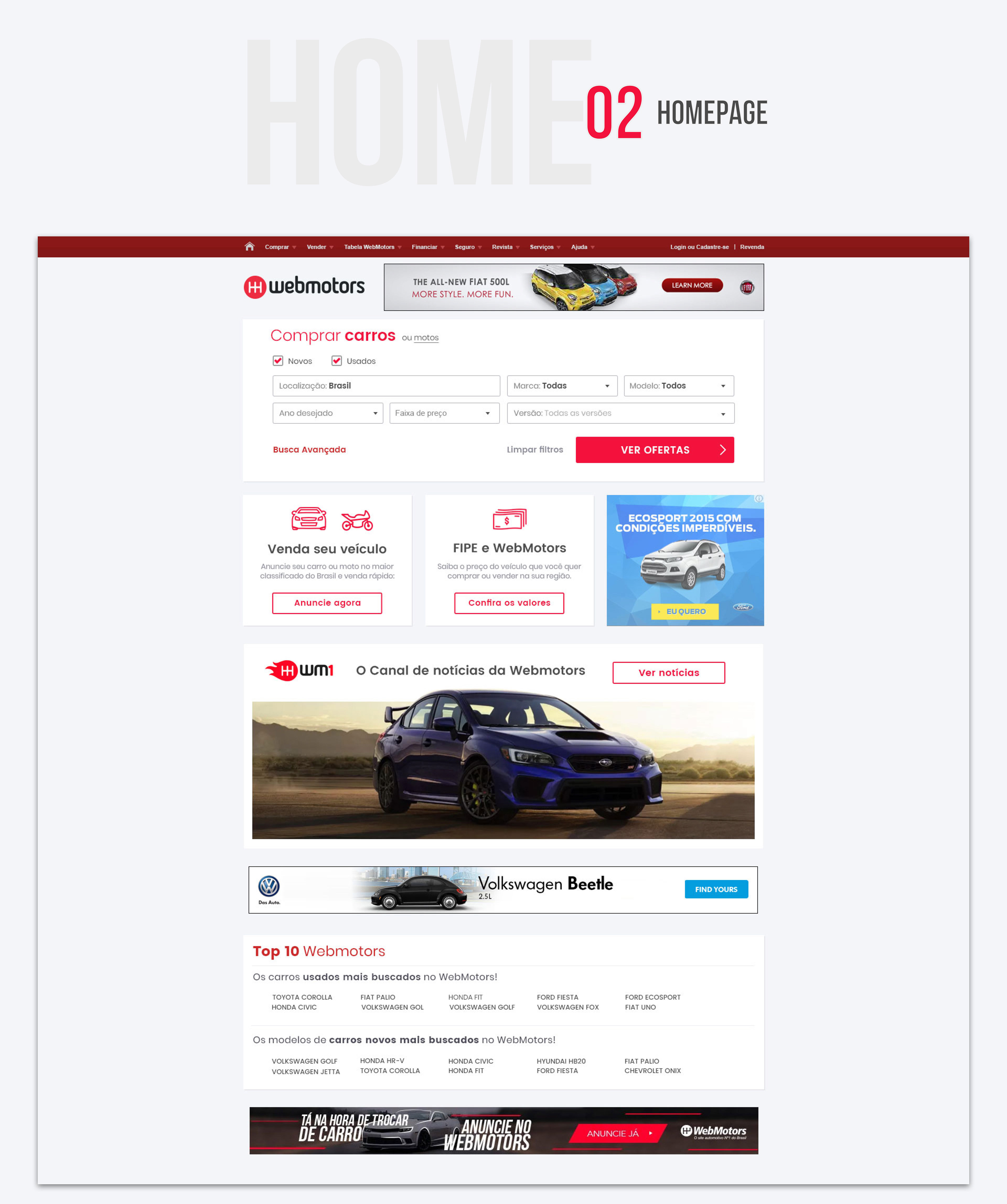
For over 20 years, Webmotors has been Brazil's leading online car sales platform. Despite its market dominance, the company's website had a significant flaw: its design was dictated by fleeting trends rather than by in-depth user experience research. In a market where ROI is paramount, a purely aesthetic approach to design was no longer sustainable. A complete redesign of the homepage and search results pages was crucial to reduce friction and boost conversions.
Our Approach
To address this challenge, I focused on User Research, Information Architecture, and User Interface. Launched a comprehensive study to understand user behavior and motivations. We combined qualitative and quantitative methods to build a complete picture:
User Interviews
I conducted interviews to gather qualitative feedback directly from our users, uncovering their pain points and goals.
I conducted interviews to gather qualitative feedback directly from our users, uncovering their pain points and goals.
Analytics Deep Dive
Analyzed CrazyEgg heat maps and click data to see where and how often users were interacting with the site.
We also used Google Analytics data to identify which areas of the website and services were most popular, helping us prioritize what mattered most.
Analyzed CrazyEgg heat maps and click data to see where and how often users were interacting with the site.
We also used Google Analytics data to identify which areas of the website and services were most popular, helping us prioritize what mattered most.
Key Findings & Solutions
By cross-referencing our data, we identified clear patterns that informed our redesign decisions:
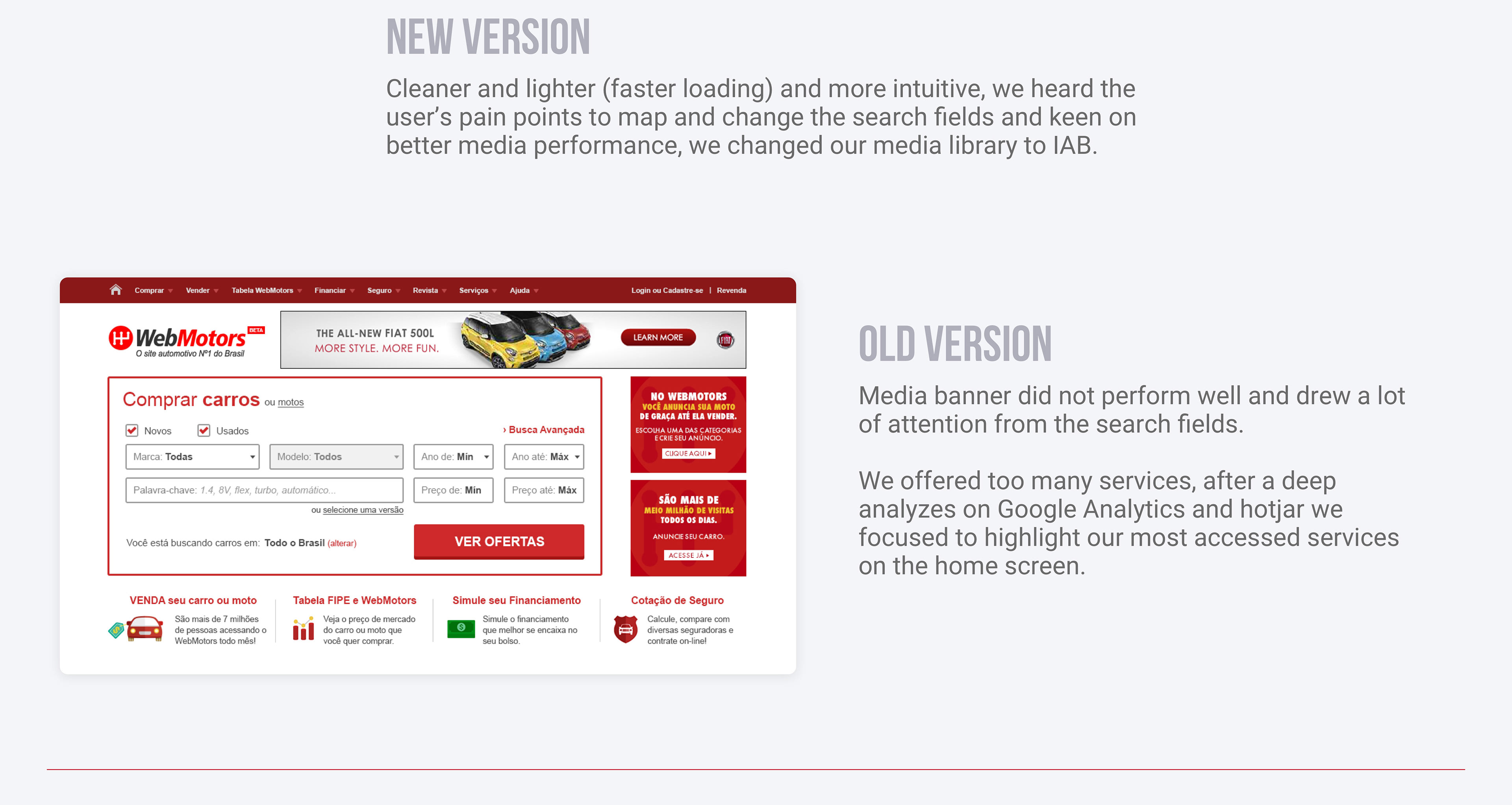
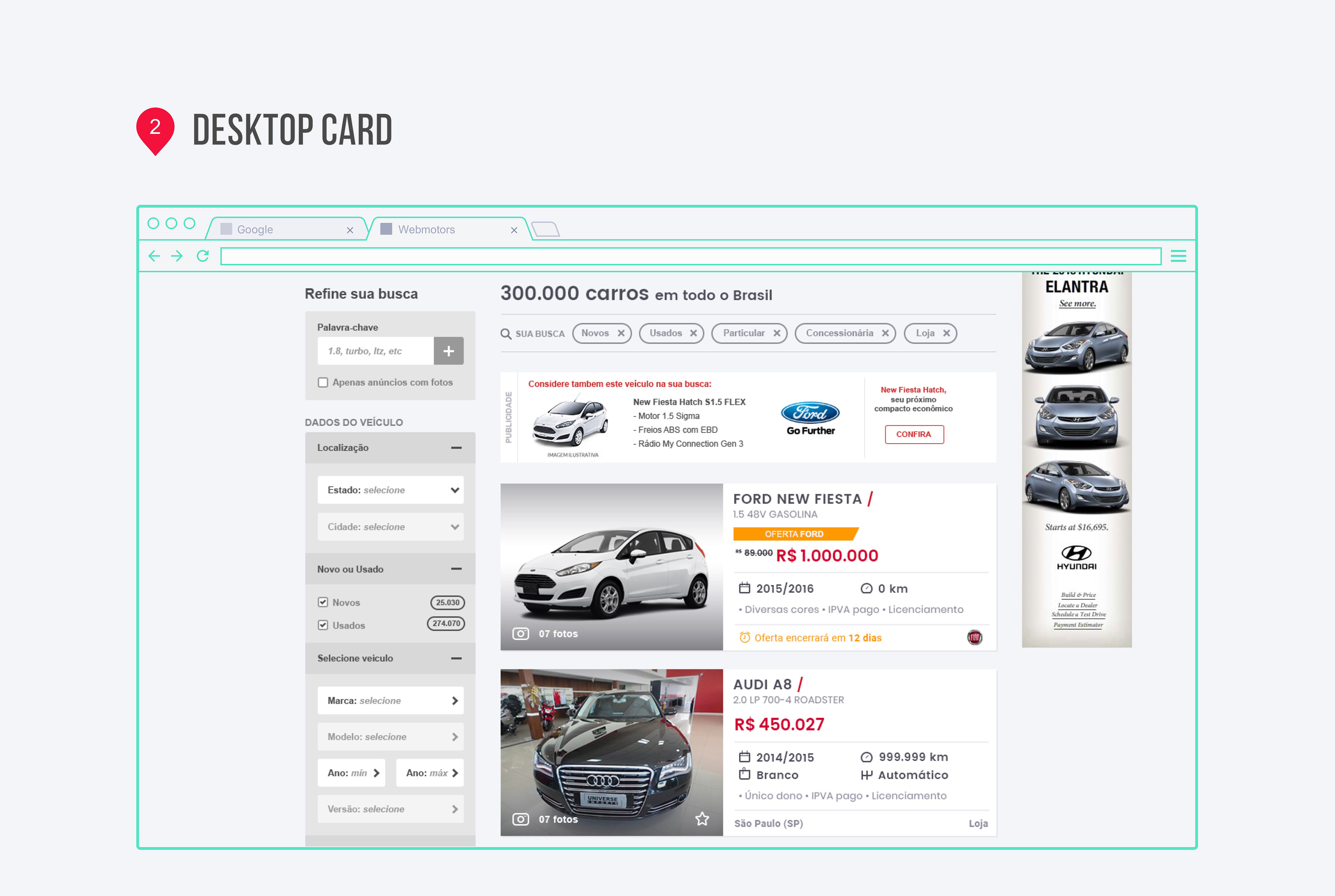
Location is King
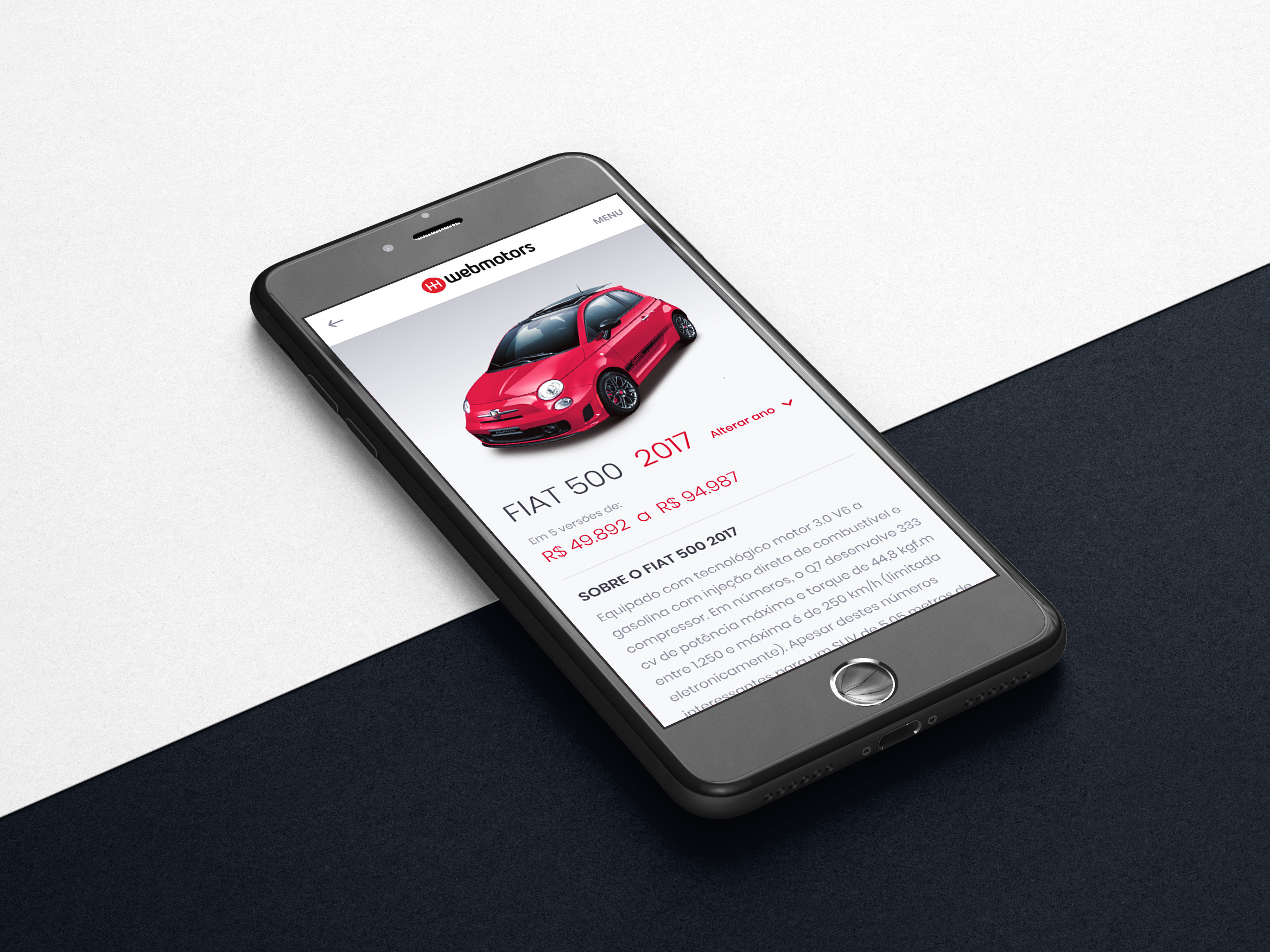
We found that a user's location was the most important search filter. To streamline the experience, we prioritized this field, ensuring users could find cars as close to them as possible.
We found that a user's location was the most important search filter. To streamline the experience, we prioritized this field, ensuring users could find cars as close to them as possible.
Brand and Model Preference
The second most critical piece of information was the make and model. We adjusted the information architecture to make these fields more prominent, catering to users who already had specific brands in mind.
The second most critical piece of information was the make and model. We adjusted the information architecture to make these fields more prominent, catering to users who already had specific brands in mind.
Pre-filled Search Filters
Our research showed that open-ended fields for car year and price range created friction. Users felt uncertain about what years or price points would yield the best results. To solve this, we changed the open input to a pre-filled option to select:
Our research showed that open-ended fields for car year and price range created friction. Users felt uncertain about what years or price points would yield the best results. To solve this, we changed the open input to a pre-filled option to select:
Pre-filled Year Ranges
We provided pre-calculated year ranges, making it easier for users to select a range without manual effort.
We provided pre-calculated year ranges, making it easier for users to select a range without manual effort.
Predetermined Price Ranges
Since many users also used the app to value their own cars, an open-ended price range was unhelpful. We introduced predetermined price ranges, reducing friction and making the search process smoother and more intuitive.
Since many users also used the app to value their own cars, an open-ended price range was unhelpful. We introduced predetermined price ranges, reducing friction and making the search process smoother and more intuitive.
My Contribution
My role was central to this project's success. I drove the User Research to uncover the core user needs, used these insights to inform the Information Architecture of the new search flow, and applied principles of Usability Testing to validate all design choices. Finally, I contributed to the User Interface, including the font and color study, to ensure the final product was not only effective but also visually coherent and easy to use.