Leading the UX/UI redesign of an enterprise content management platform.
Censhare: A Universal Content Management Platform
The censhare platform is a robust, all-in-one solution that unifies Product Information Management (PIM), Digital Asset Management (DAM), and Content Management (CMS). Its core purpose is to give marketing teams the freedom to create and manage digital assets, then automatically adapt them for any channel, language, and audience.
As a key member of this ambitious project, I was responsible for a comprehensive redesign of the platform from its foundation. My role was to define the new brand experience and shape the user experience, translating a complex enterprise solution into an intuitive and effective tool for a global audience.
Note: All content related to this project is ongoing work under a non-disclosure agreement with censhare AG. Please be respectful of this confidentiality and do not share the content with anyone.
The Challenge: A Silent Problem
My journey began with a complex enterprise platform that, on the surface, worked. However, beneath the functionality was a user experience riddled with friction. My first challenge wasn't just to redesign the platform, but to convince a feature-driven company of the value of user-centered design. I needed to prove that our users had pain points that went beyond what the existing feature list could solve.

The Realization: Our Users Were Invisible
My "aha" moment came during my initial research. I discovered that Censhare had never used personas. The product was built on assumptions, not on a deep understanding of who our users truly were. This was my turning point. It became clear that before I could build a better product, I had to make our users visible.
I made it my mission to introduce a new way of working. I led workshops to create the company's first personas and mapped their unique needs and behaviors. This single step created the tension needed: the new design was not about adding more features, but about solving real-world problems for real people.

Card sorting to define most important entry points for user navigation.
Building a New Foundation
Armed with this newfound clarity, I had a new compass. I conducted a benchmark analysis to see what competitors were doing right and then used user story mapping and card sorting to build a new information architecture from scratch. This was my moment of action. I began sketching and prototyping, not just screens, but entirely new workflows designed to eliminate our users' biggest frustrations.
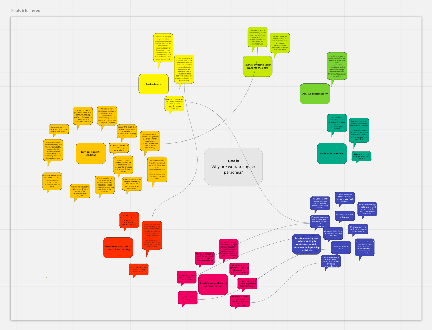
Why personas are important
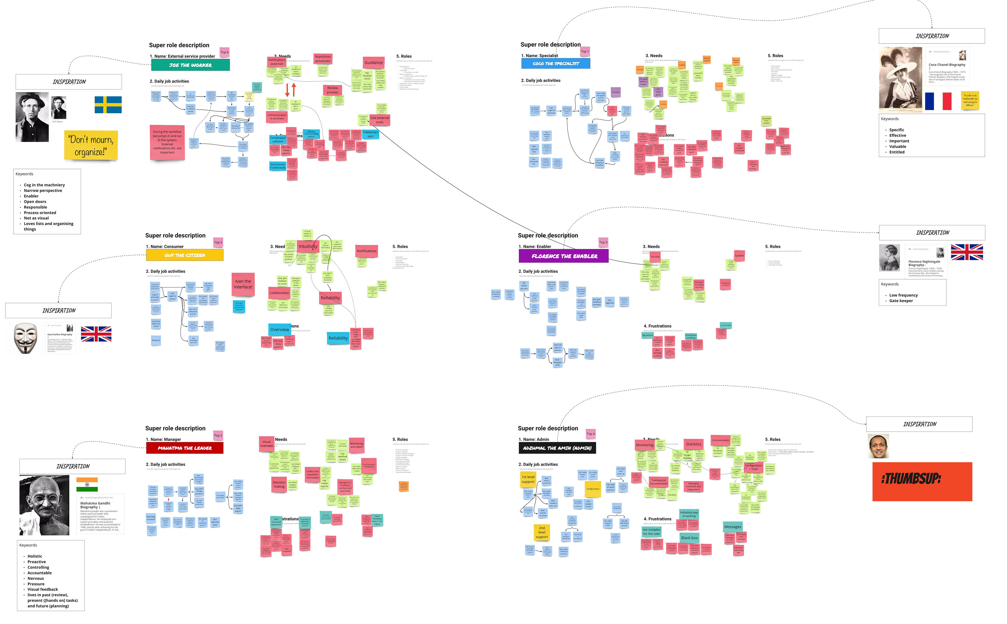
Persona: First drafts or user needs
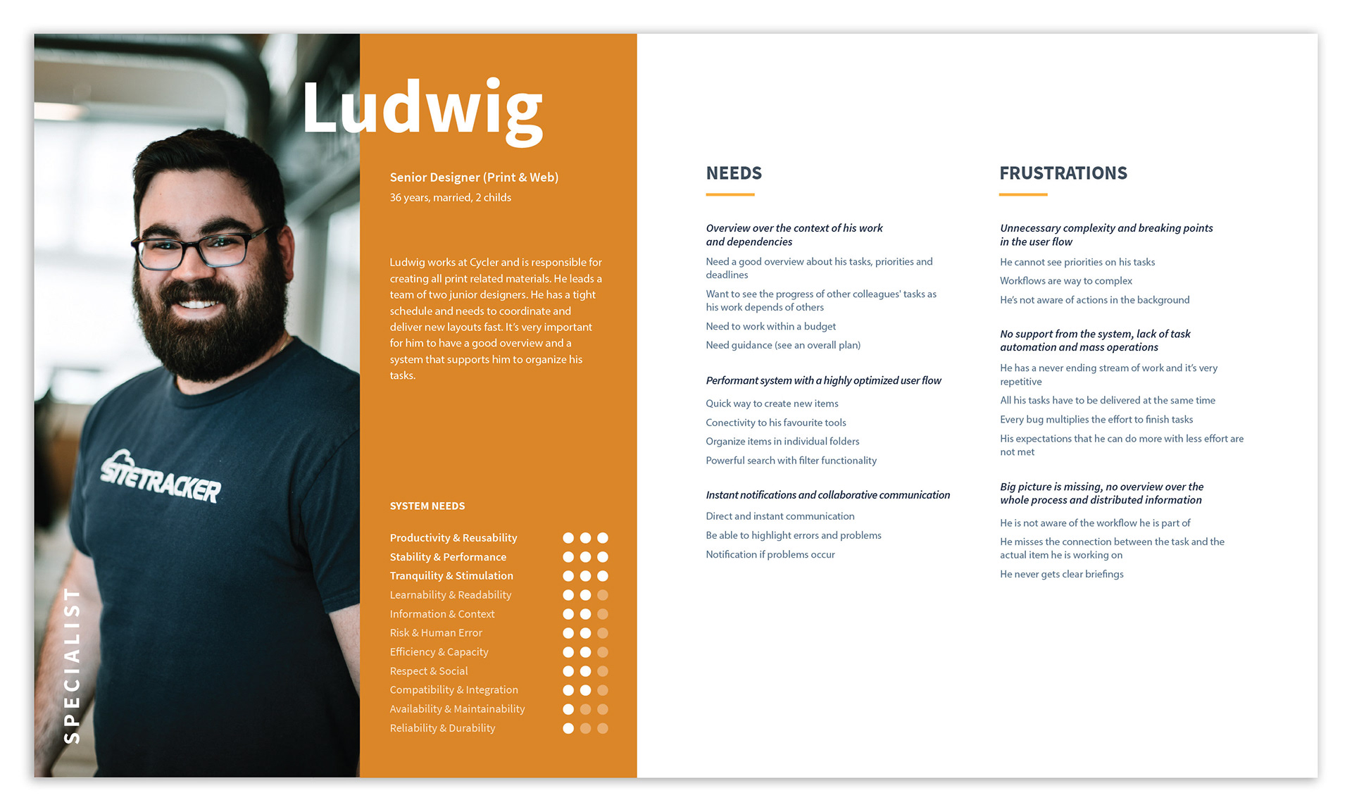
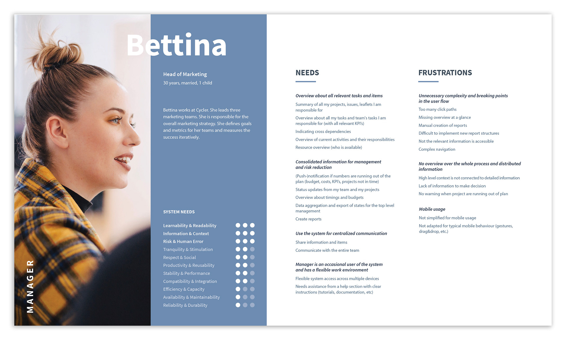
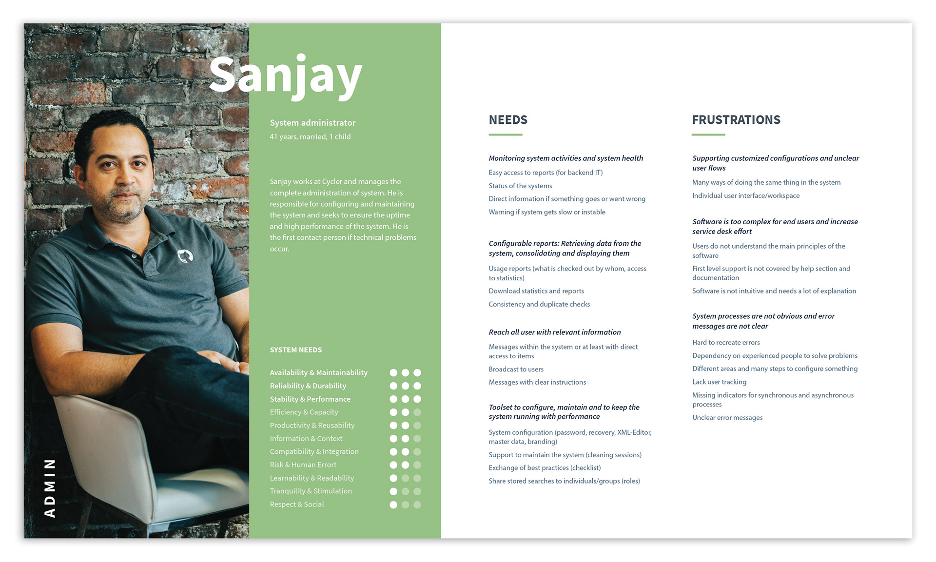
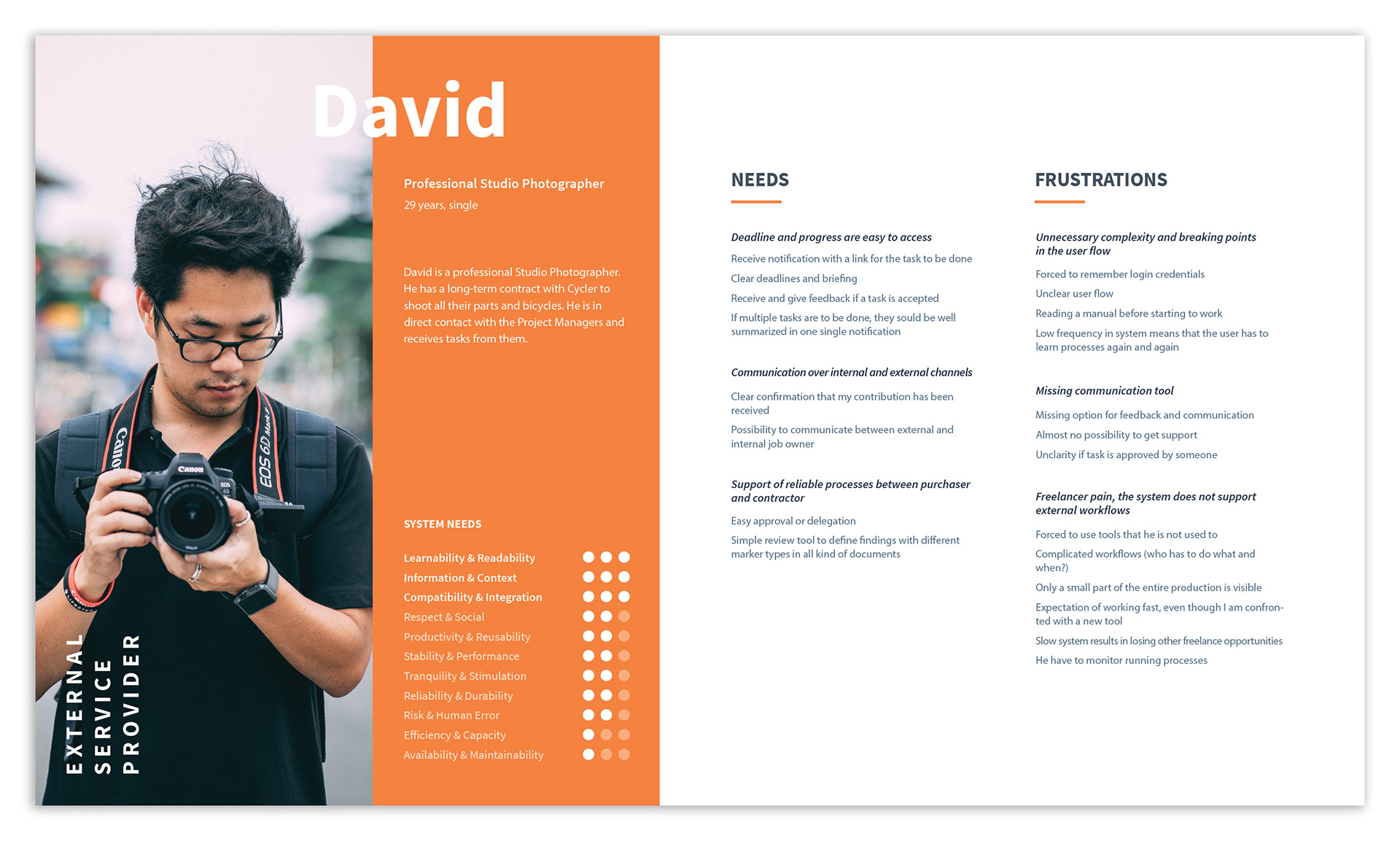
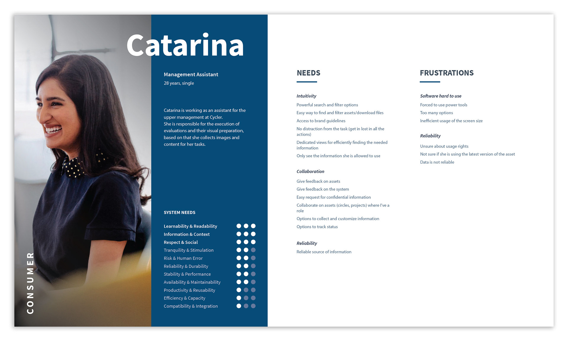
Our five final personas.
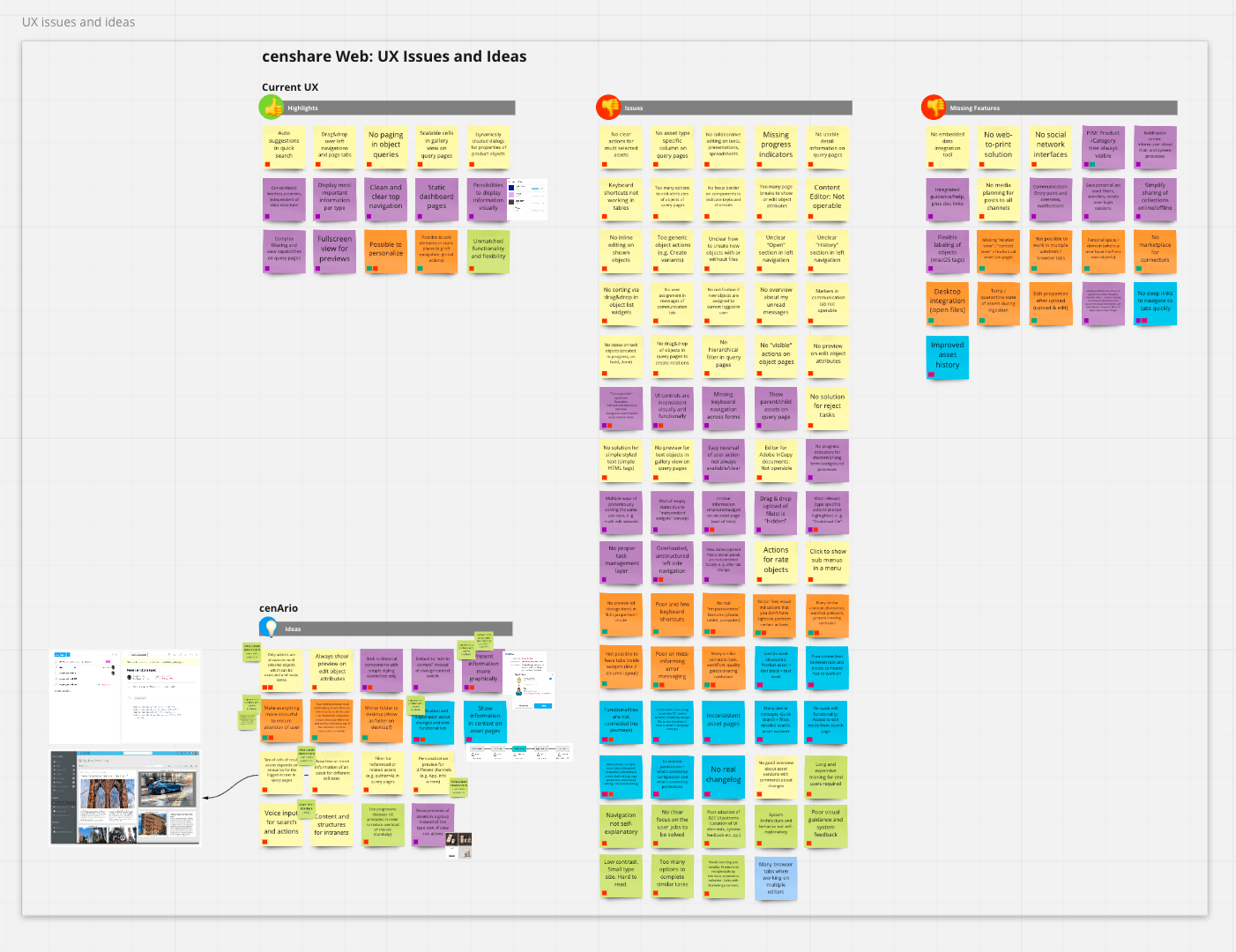
Highlights, issues and missing features from the current platform, known as censhare web.
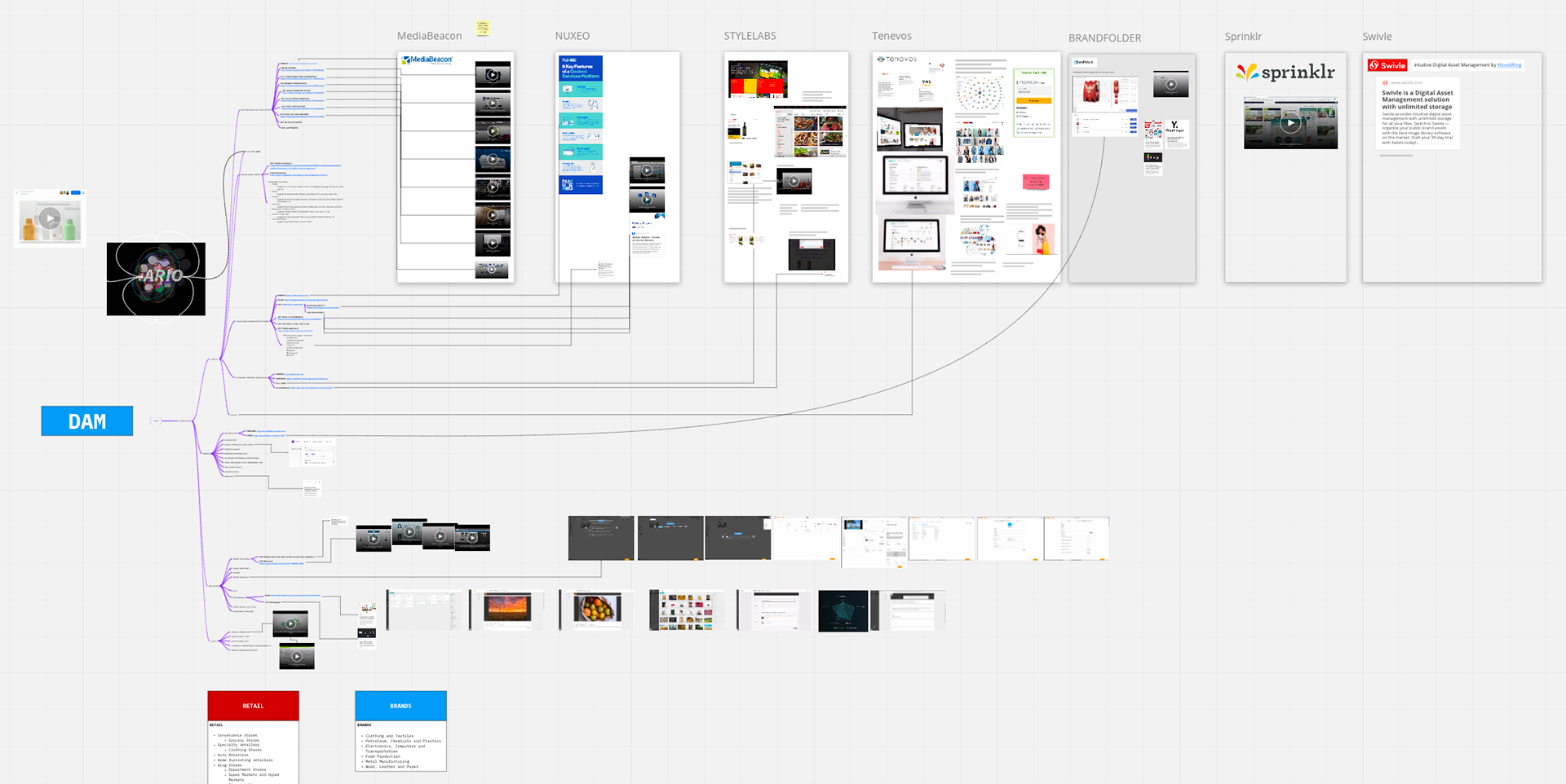
Competitor benchmark board.
Team Structure
As the Lead Product Designer on this project, I was responsible for the entire design process, from strategy to execution. I collaborated closely with a Junior UX Designer who assisted with key tasks.
My process involved conducting workshops with project managers to align on goals and build a shared understanding. I then created both low-fidelity and high-fidelity mockups, which I used to conduct usability tests and validate our design decisions with users. My final designs were brought to life by a dedicated team of Front-End and Back-End Engineers.
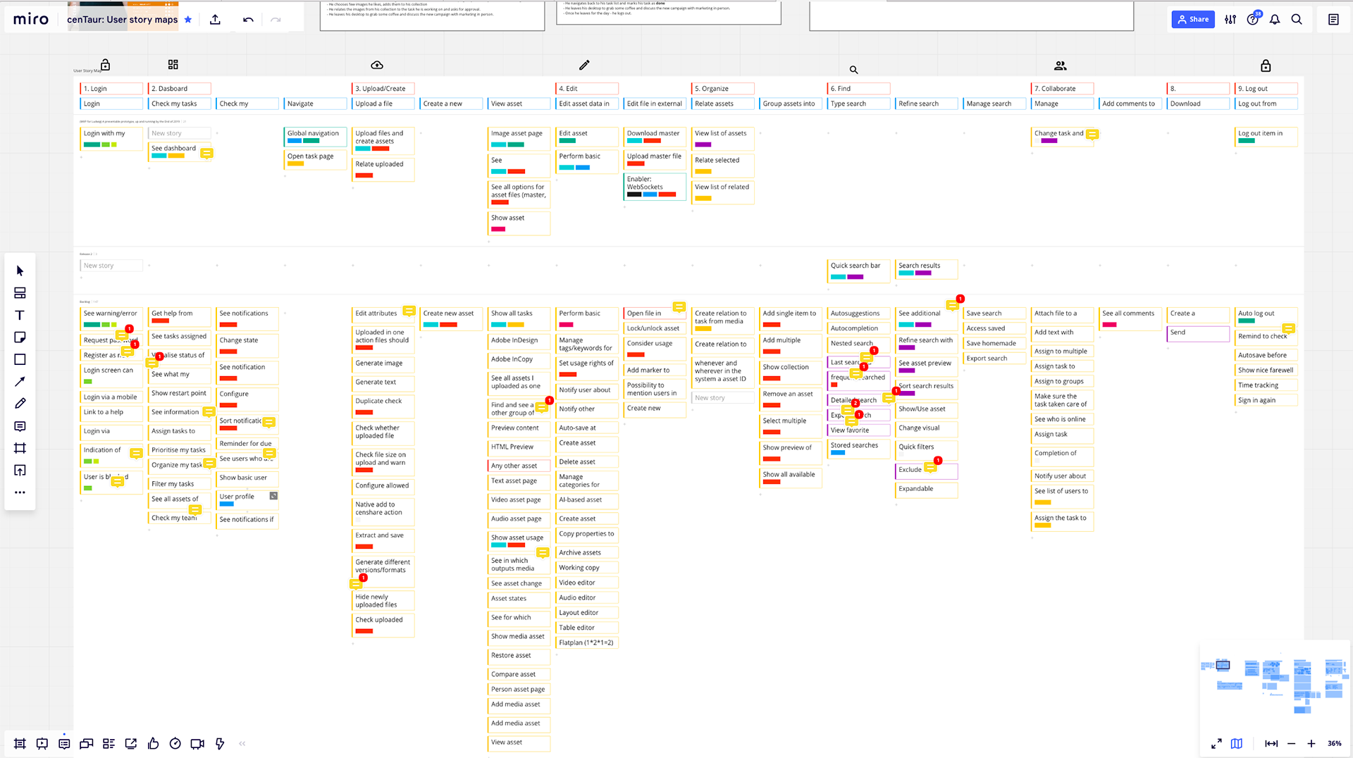
First user story map
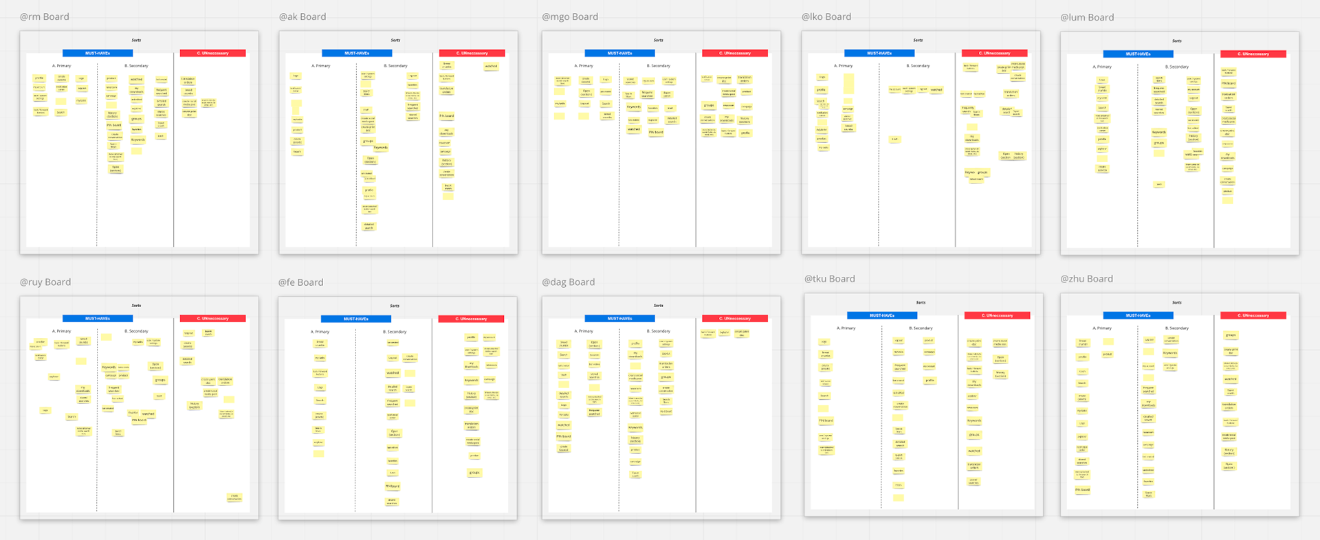
Card sorting to define most important entry points for user navigation.
To redefine the platform's architecture, I led a card sorting activity with Product Managers and Product Owners. This collaborative exercise helped us determine the most intuitive entry points and structure the navigation based on user mental models.
Validation and Results
My solution came to life in the form of a low-fidelity prototype, built on our new Zen Design System. I didn't just design in a vacuum; I validated my work by testing these prototypes with users. The feedback was overwhelmingly positive, confirming that my approach had been successful. The new design not only streamlined workflows but also provided a foundation that was intuitive, scalable, and—most importantly—built with our users at its heart.
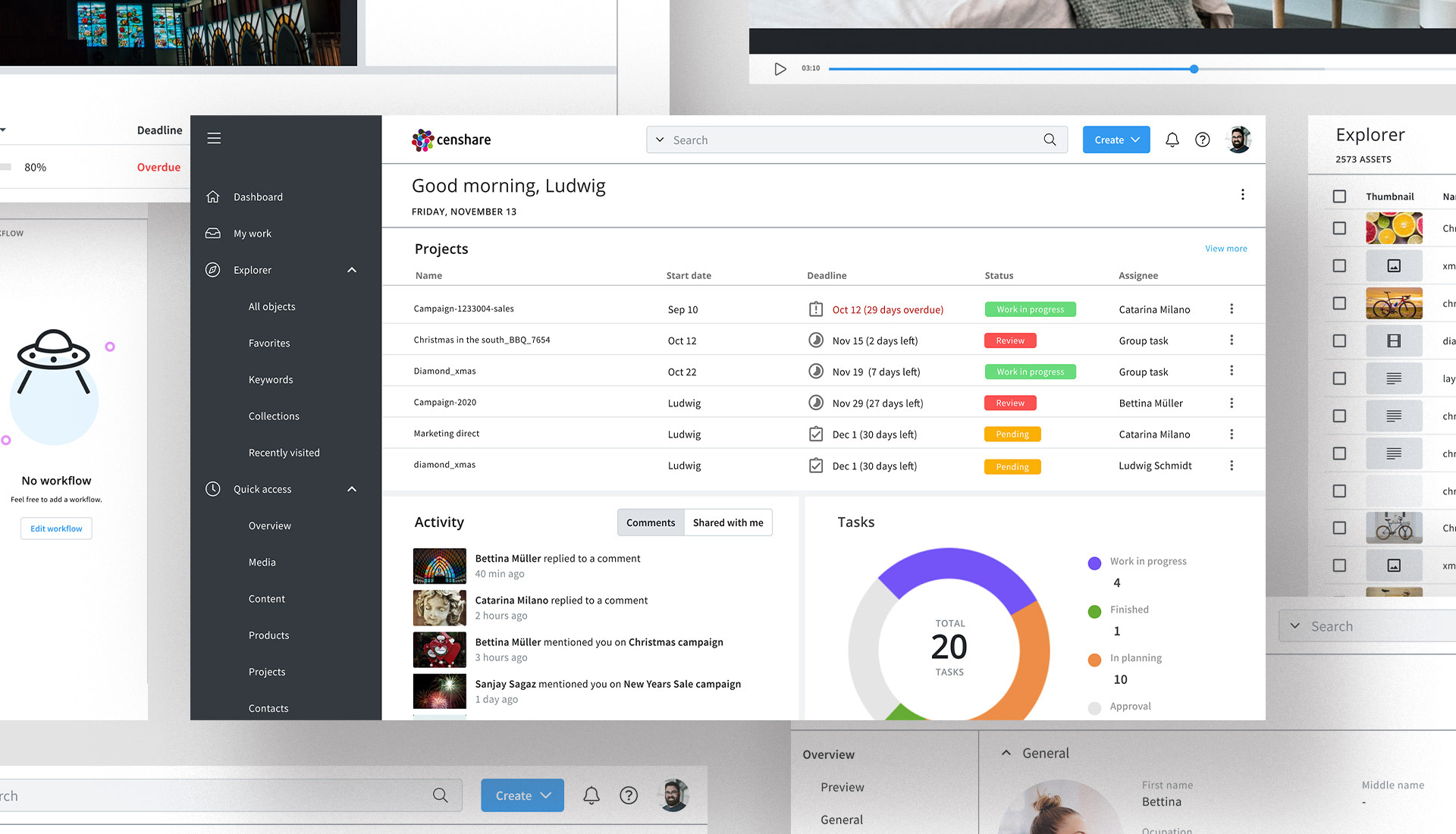
Login Page

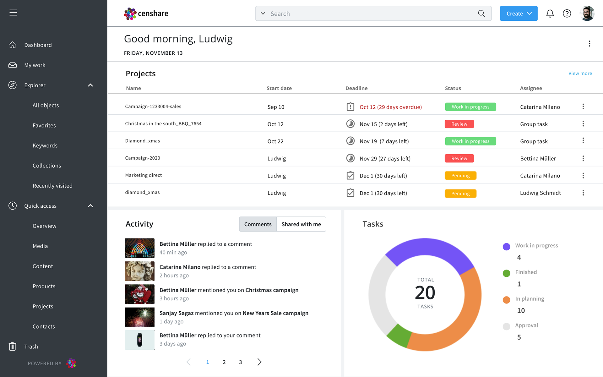
Dashboard
Asset Page
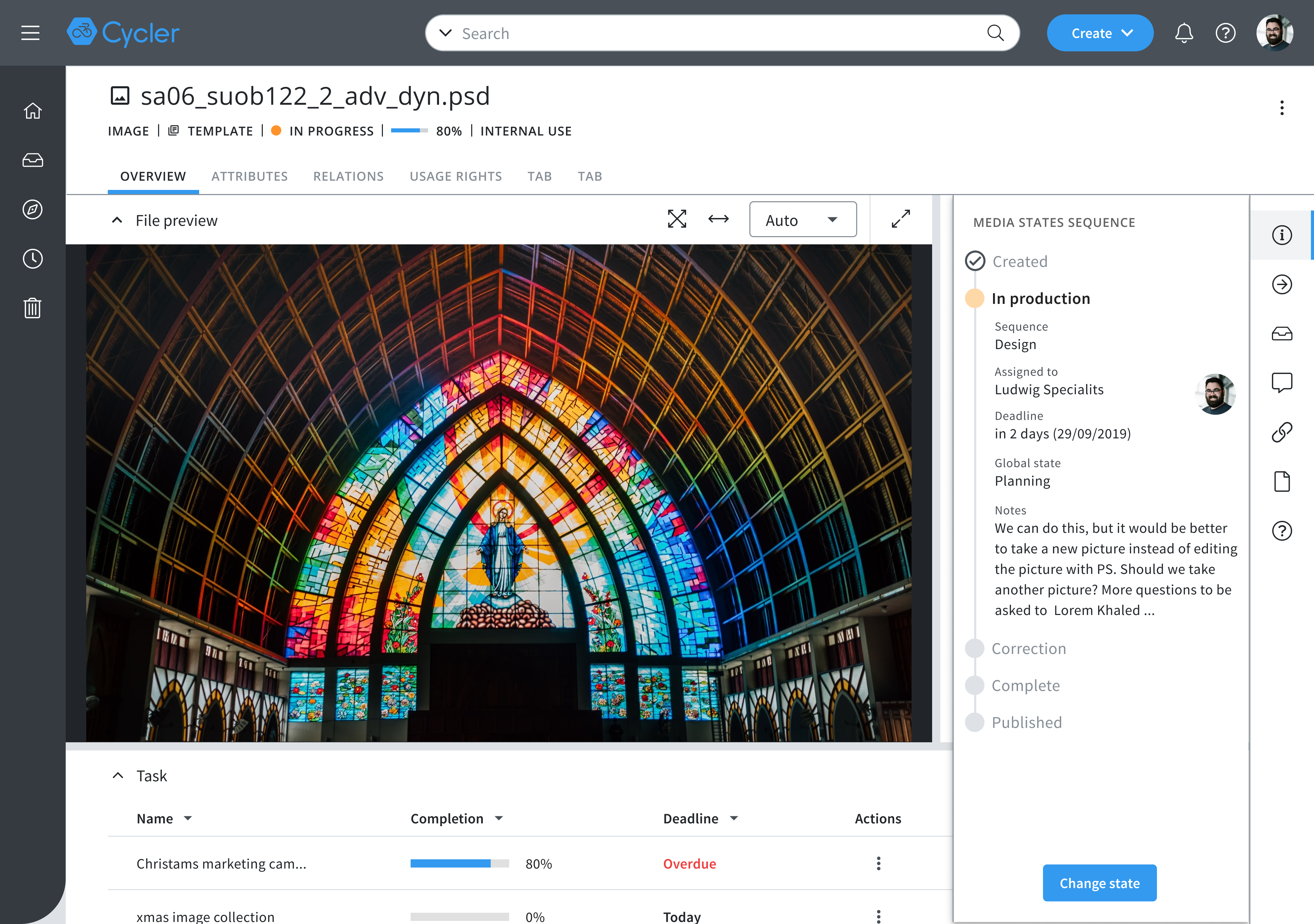
Image asset page with open Overview tab
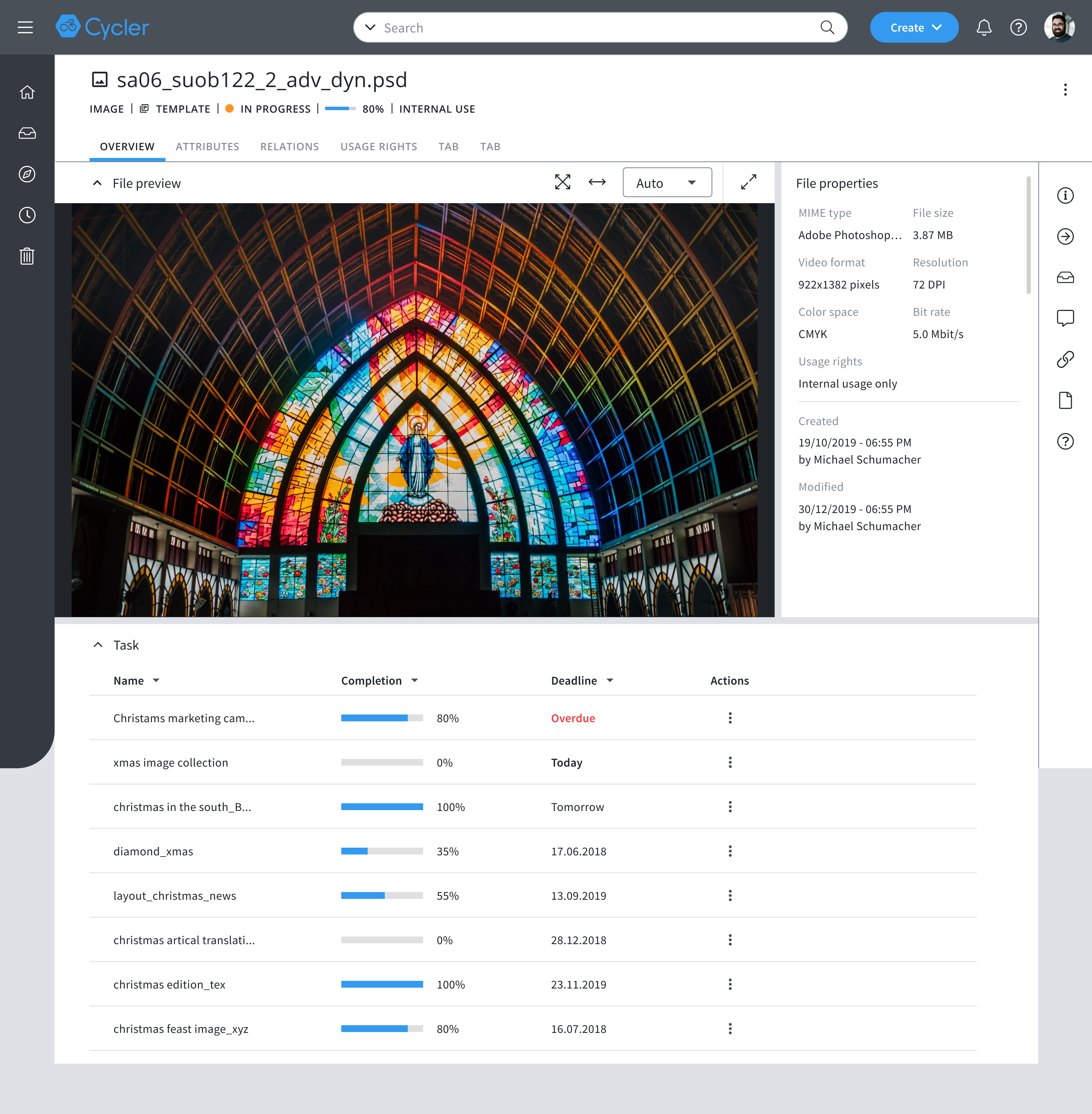
Image asset page
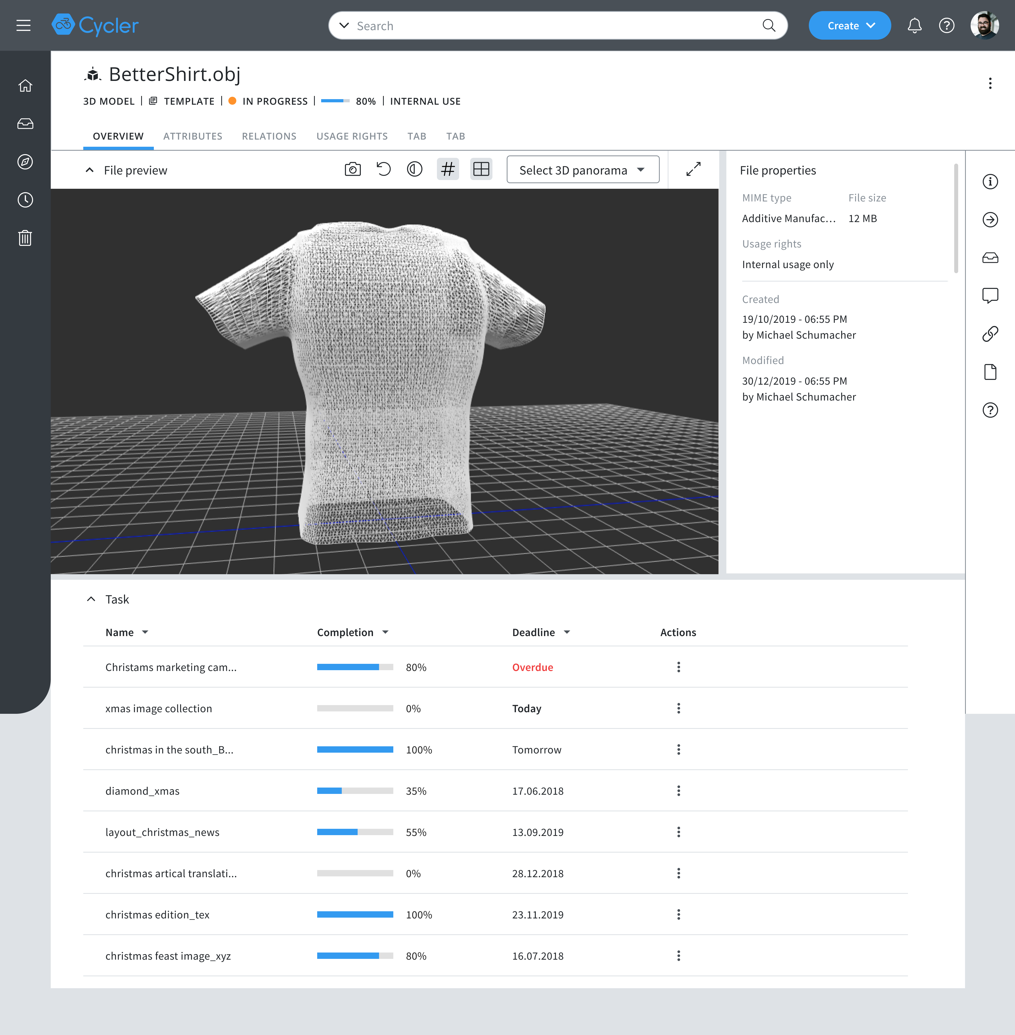
3D asset page
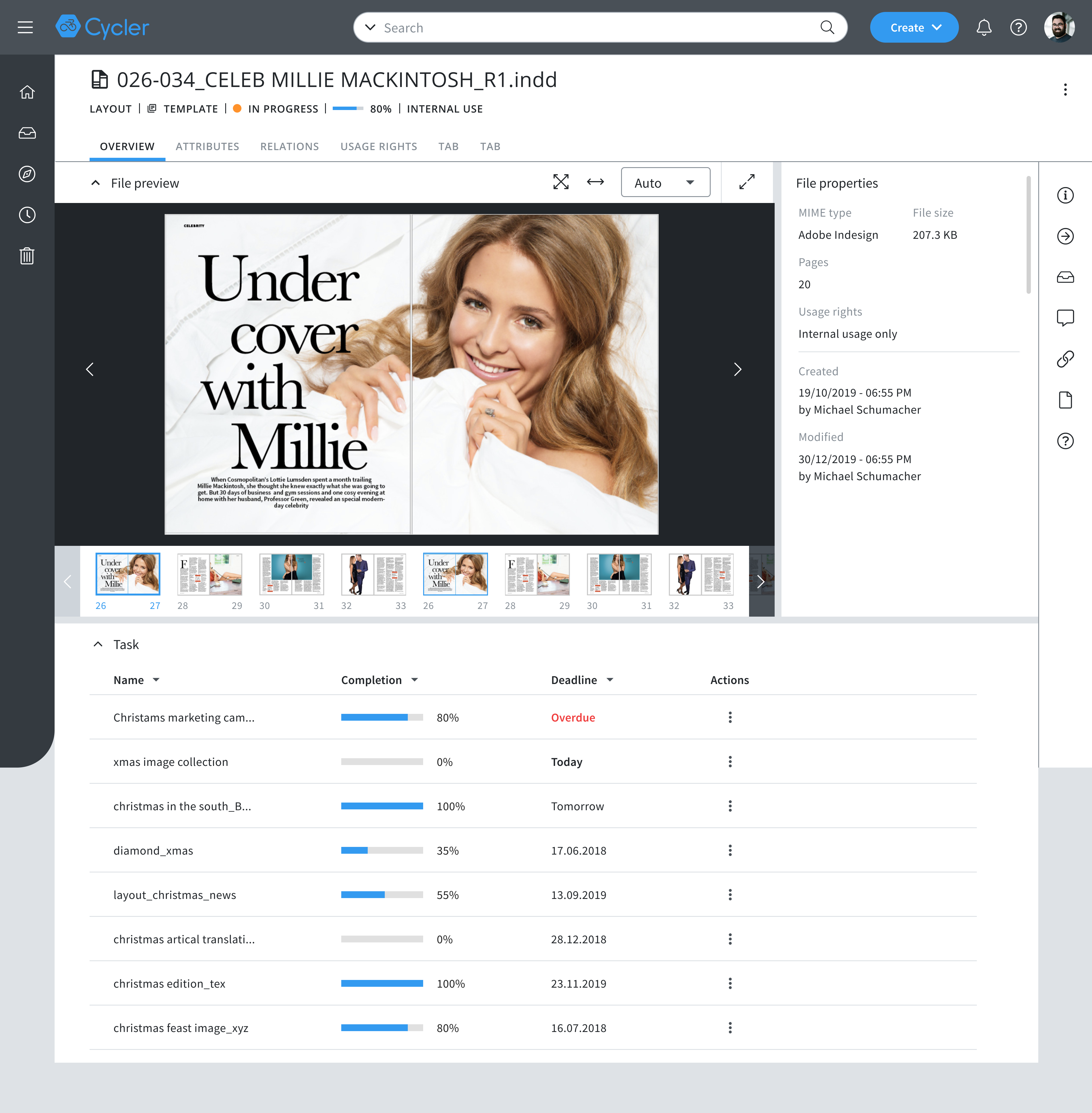
Layout asset page
Search
List view
with selection tab activated
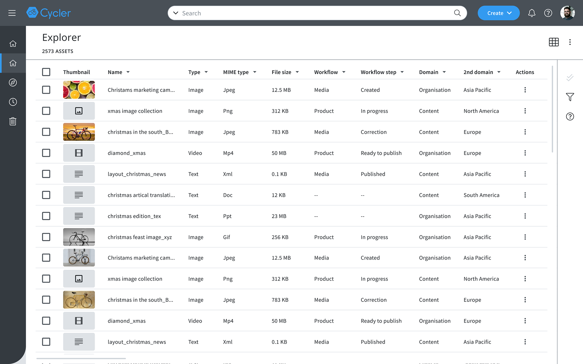
Search result page
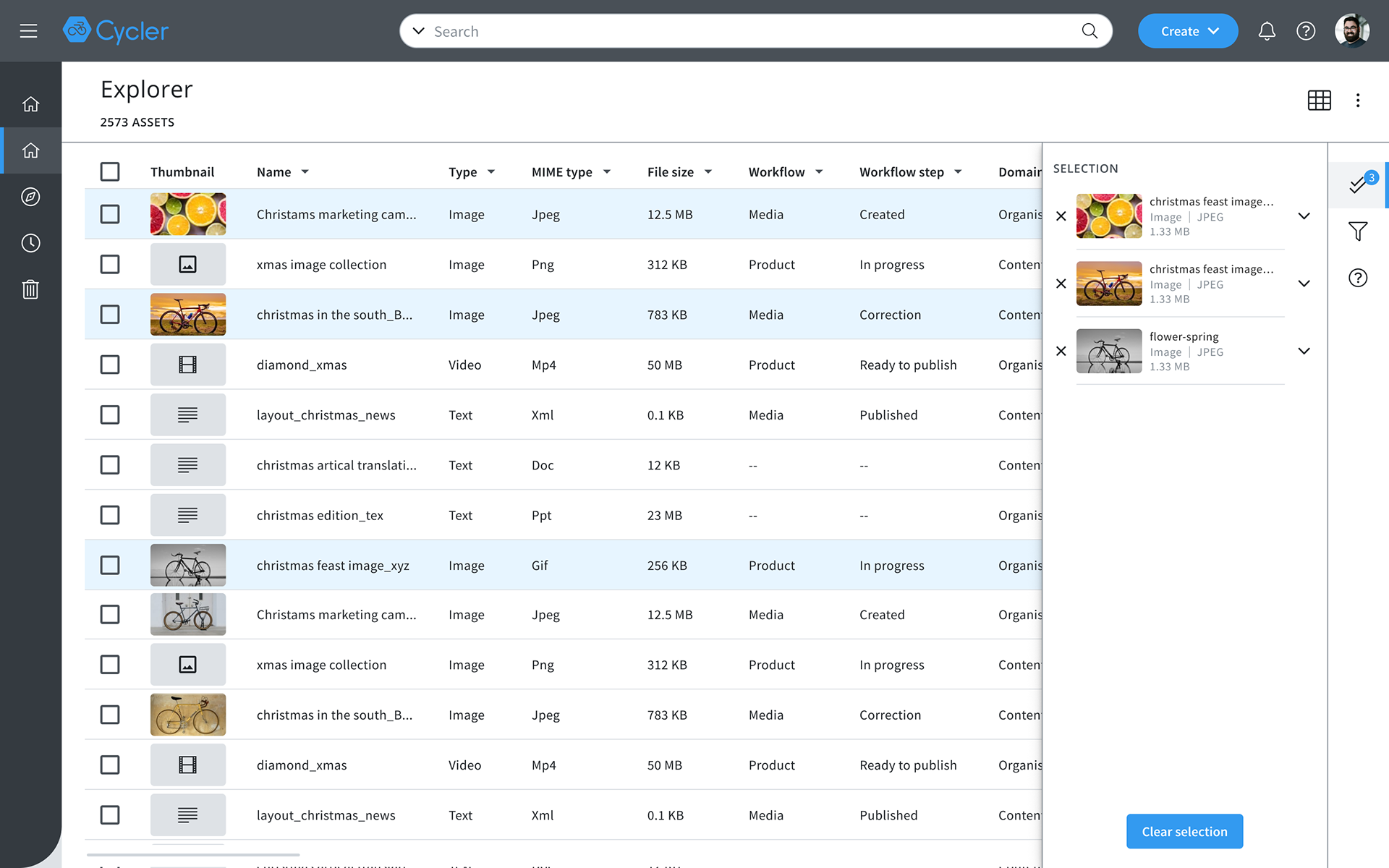
Selection side bar show all selected assets
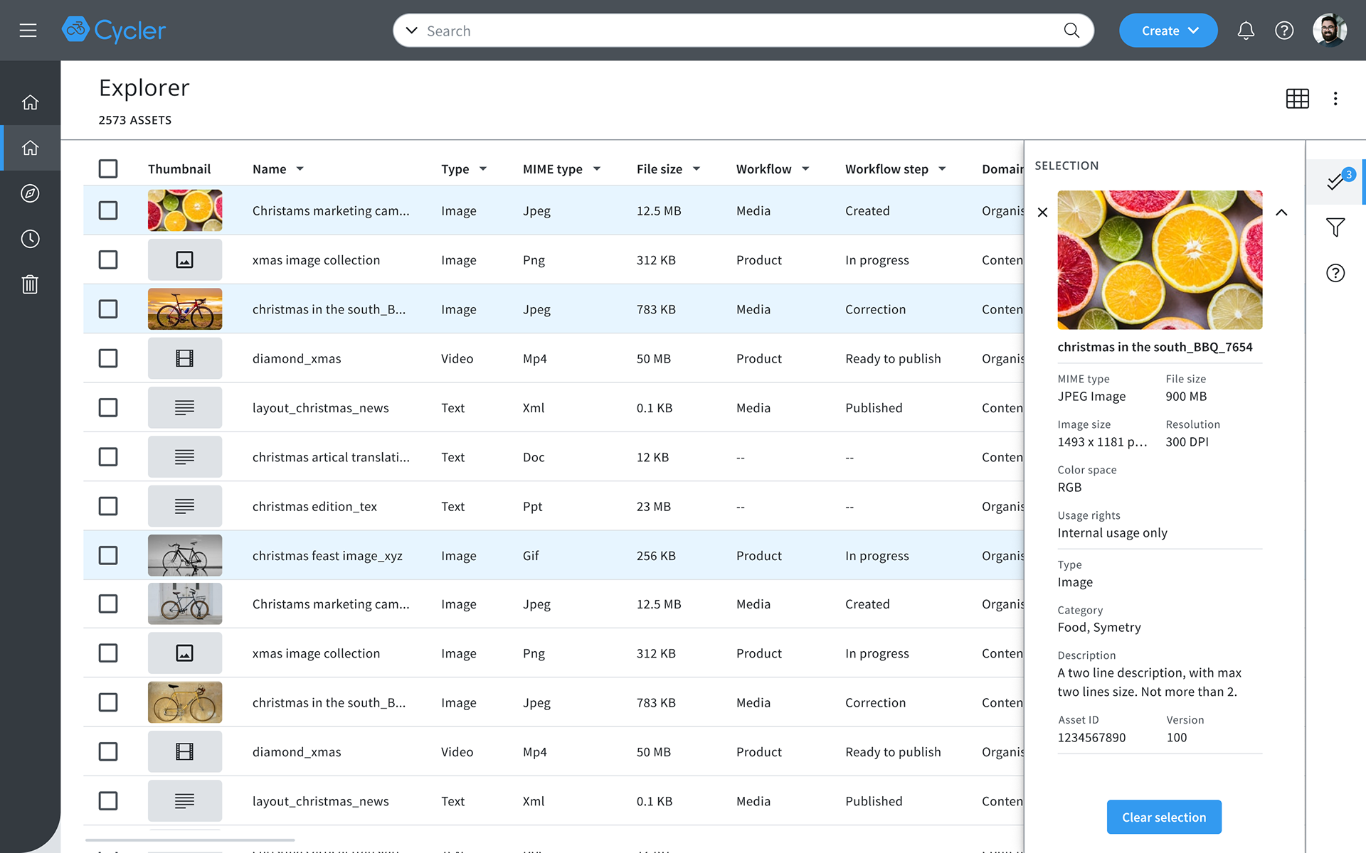
User can check asset's overview data
Each Asset type show different information on side bar, some examples on the right
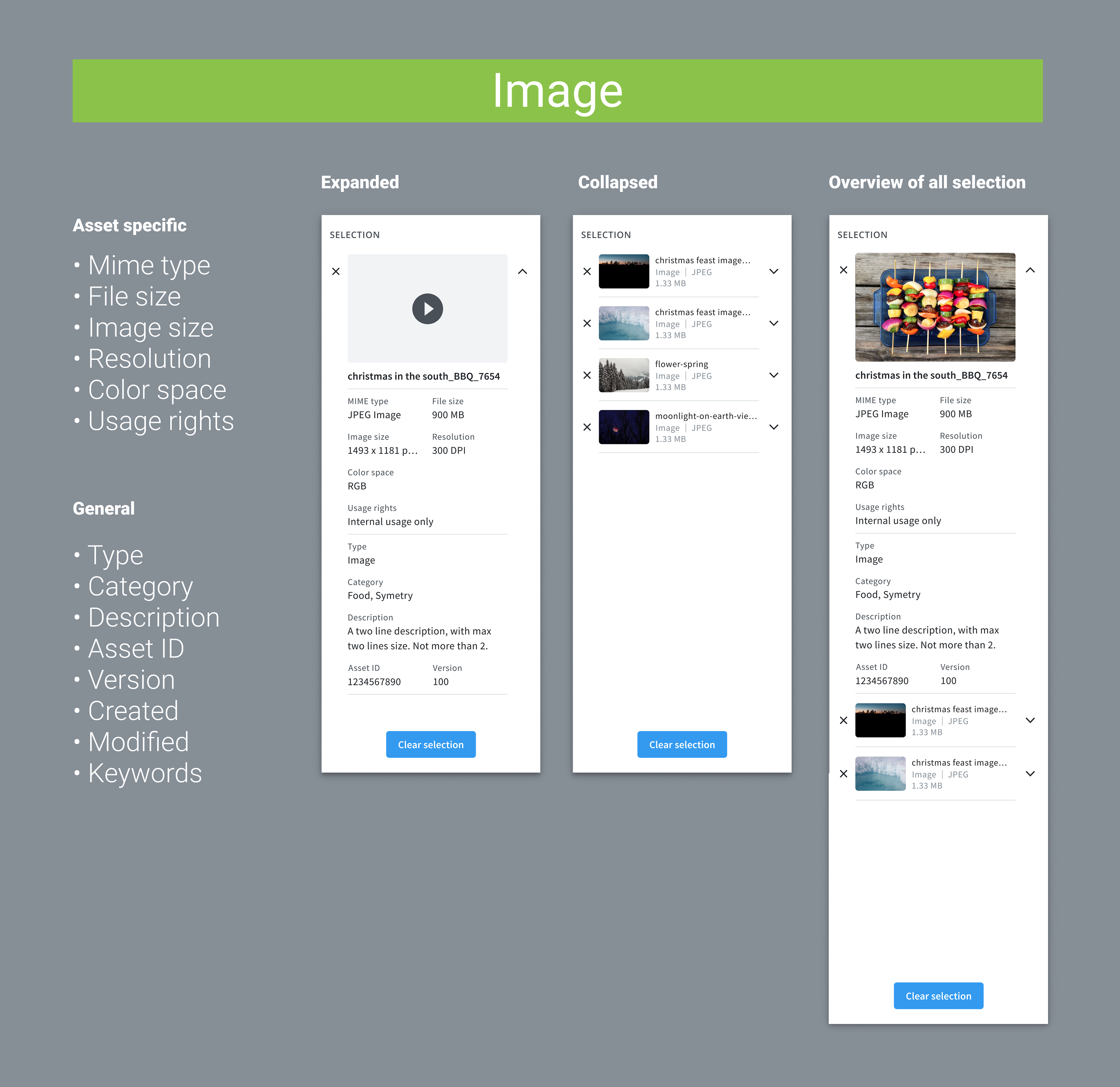
Selection data for Image
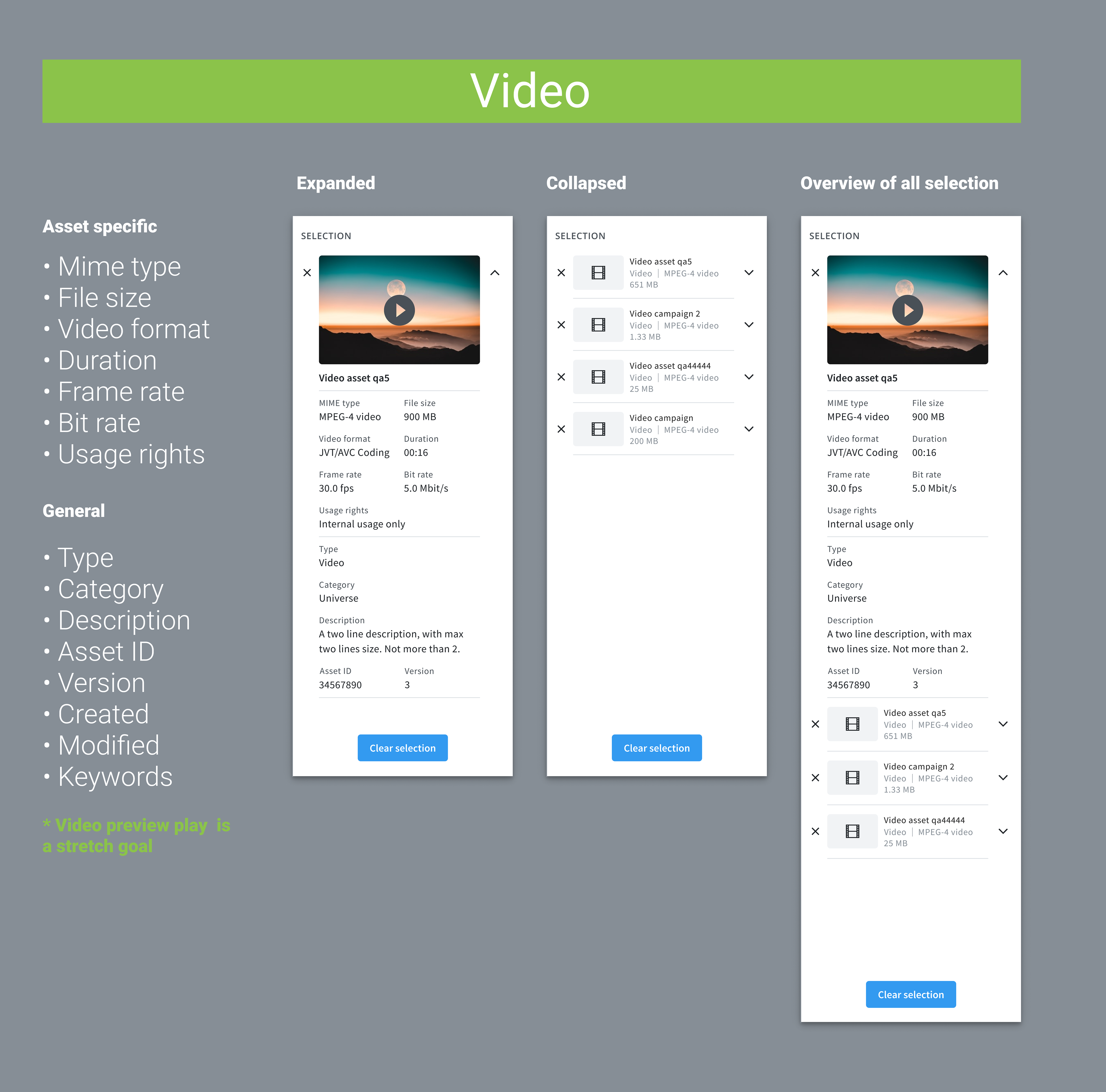
Selection data for Video
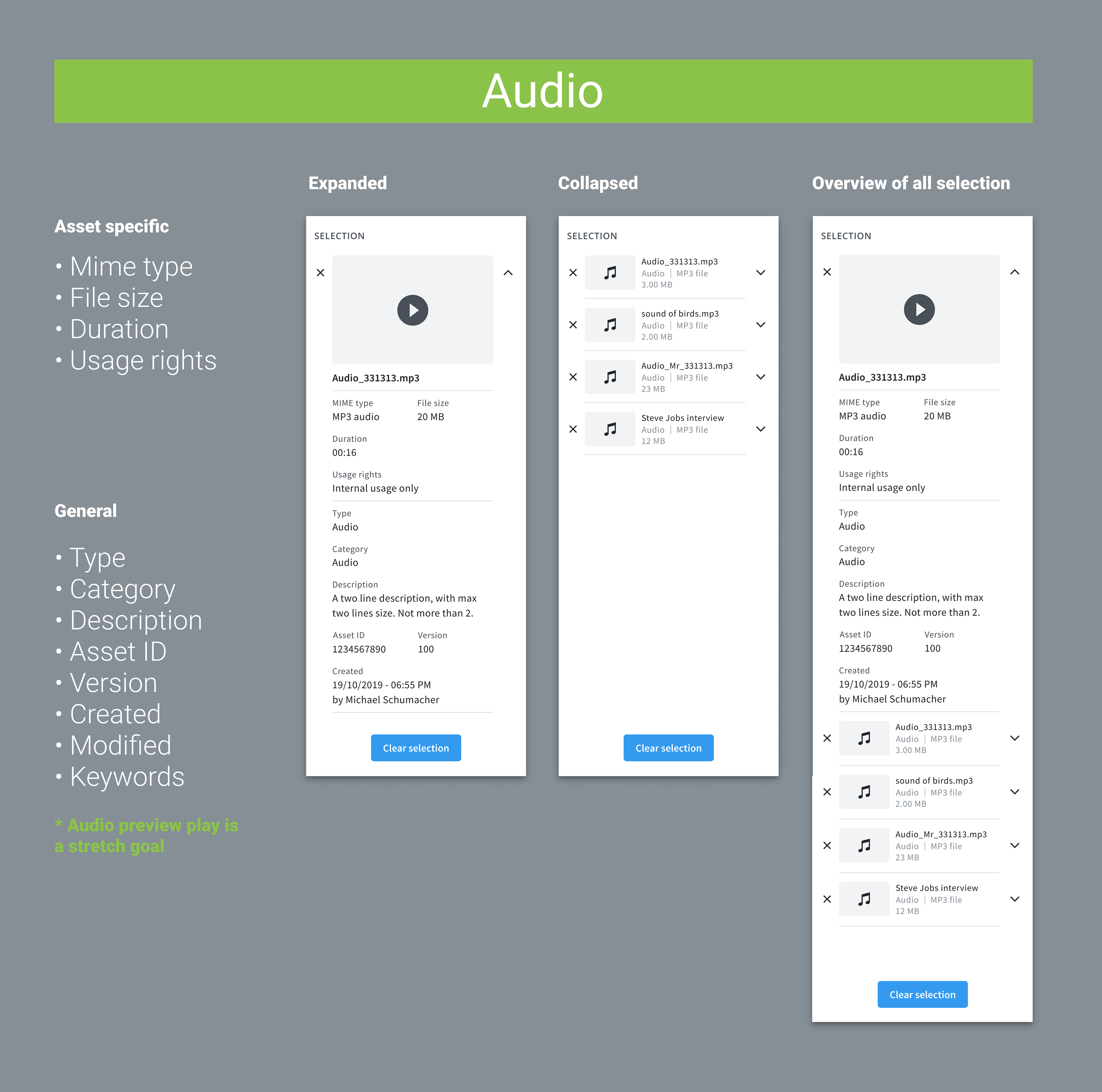
Selection data for Audio
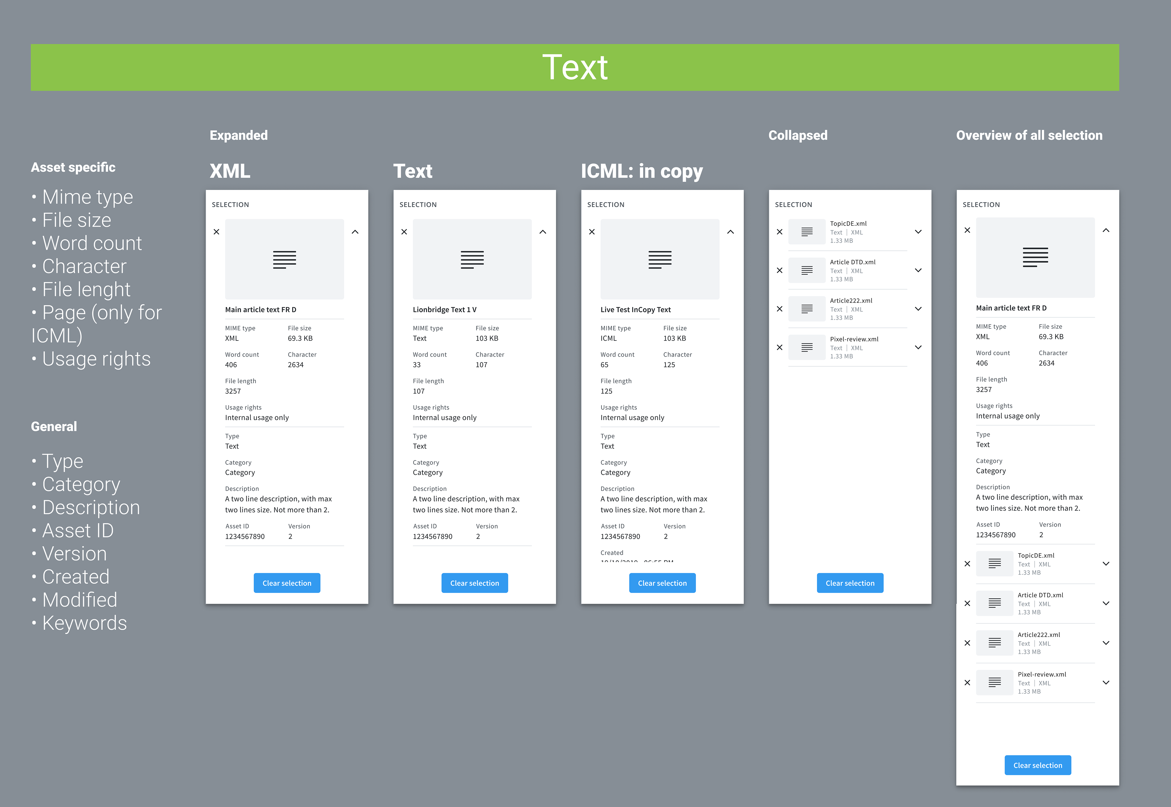
Selection data for different Text files
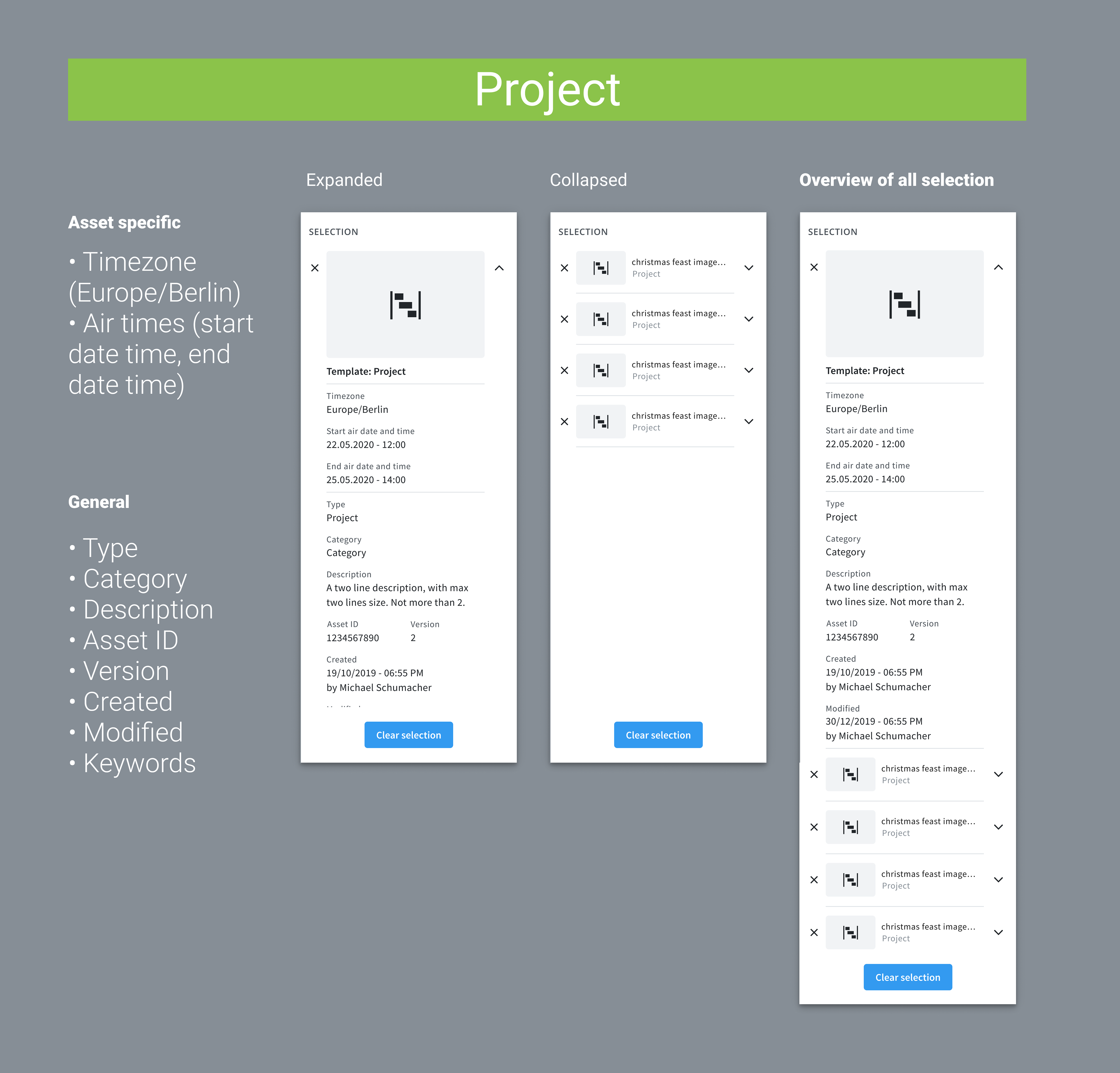
Selection data for Project
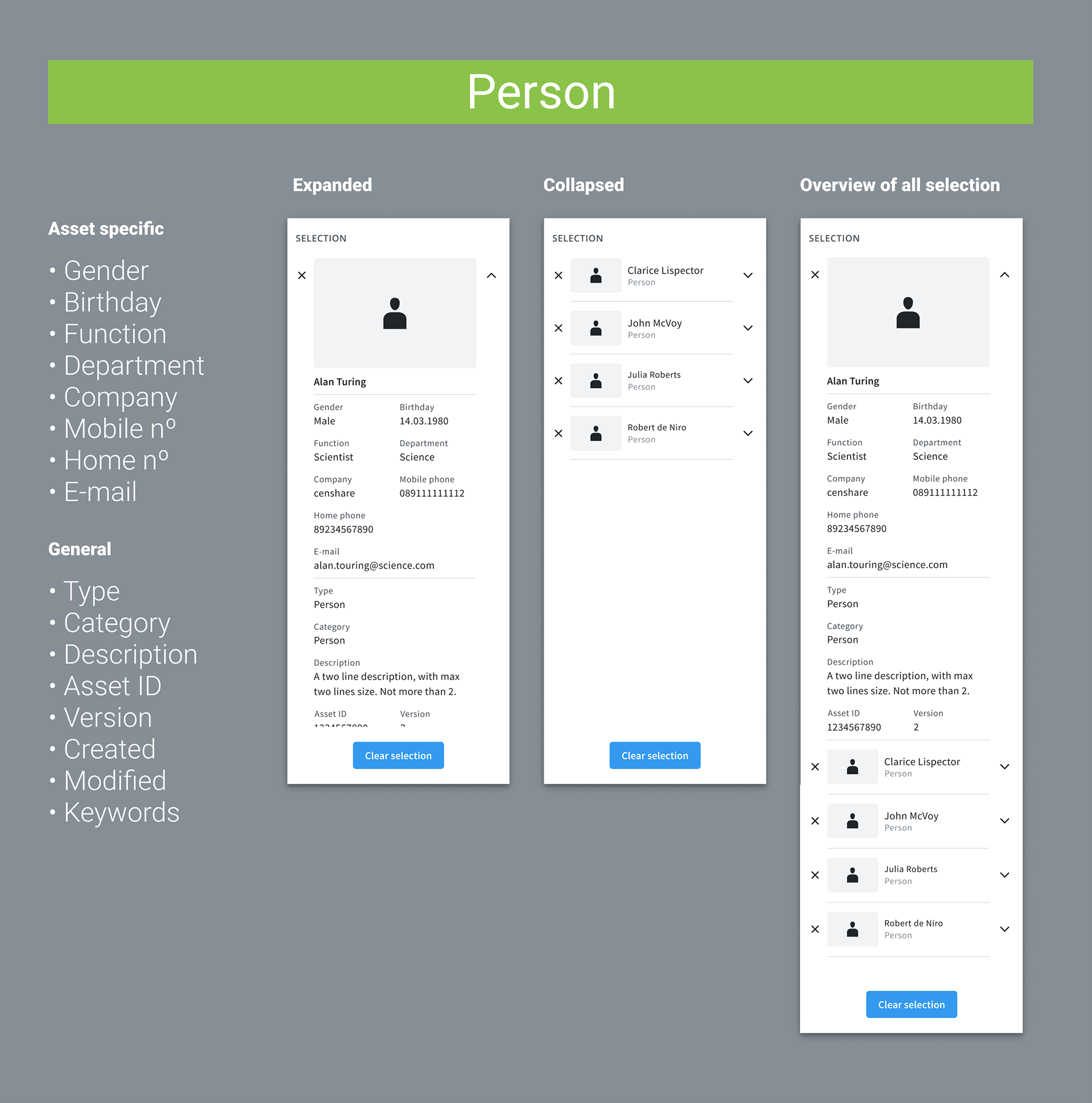
Selection data for Person
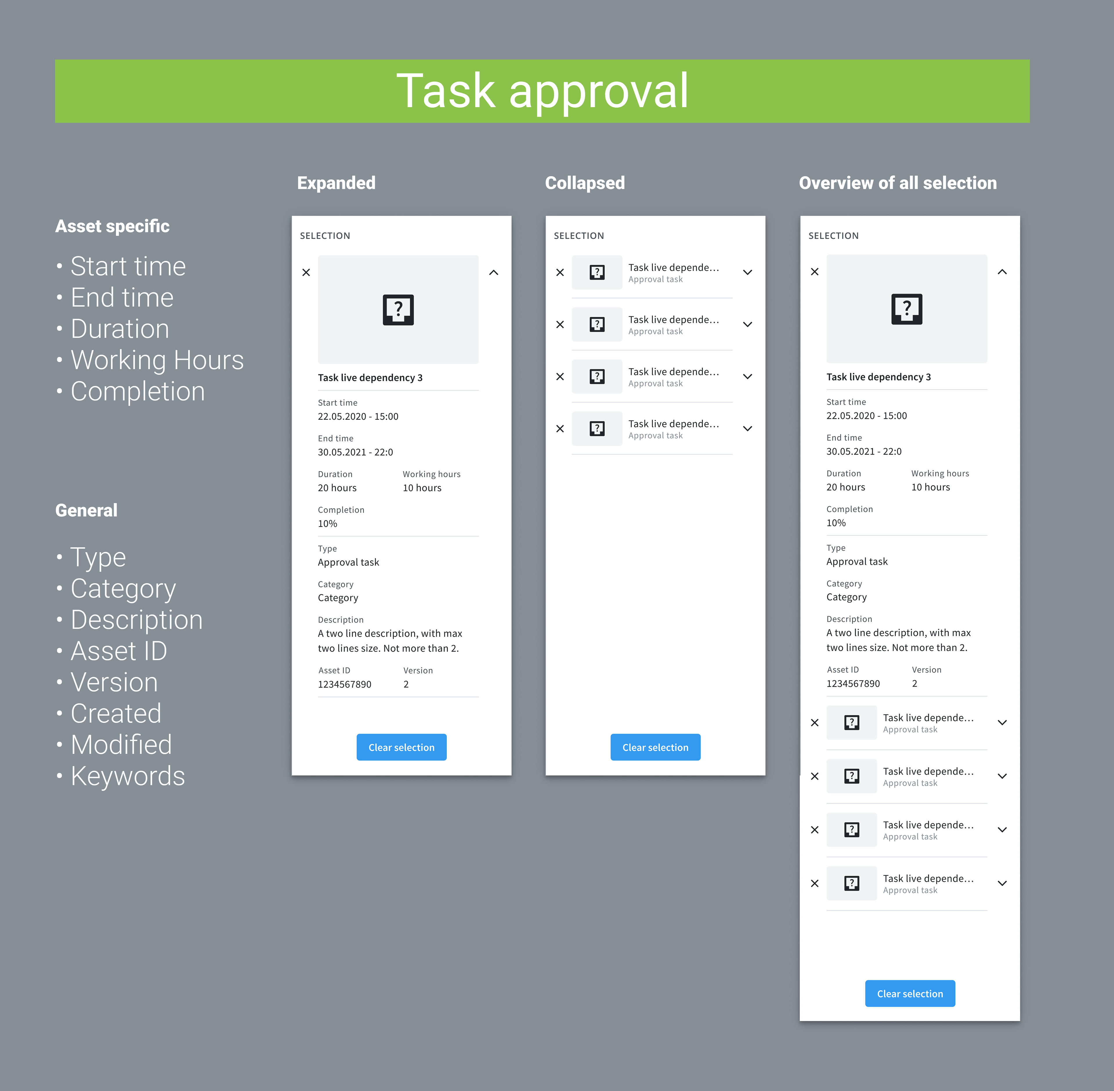
Selection data for Task Approval
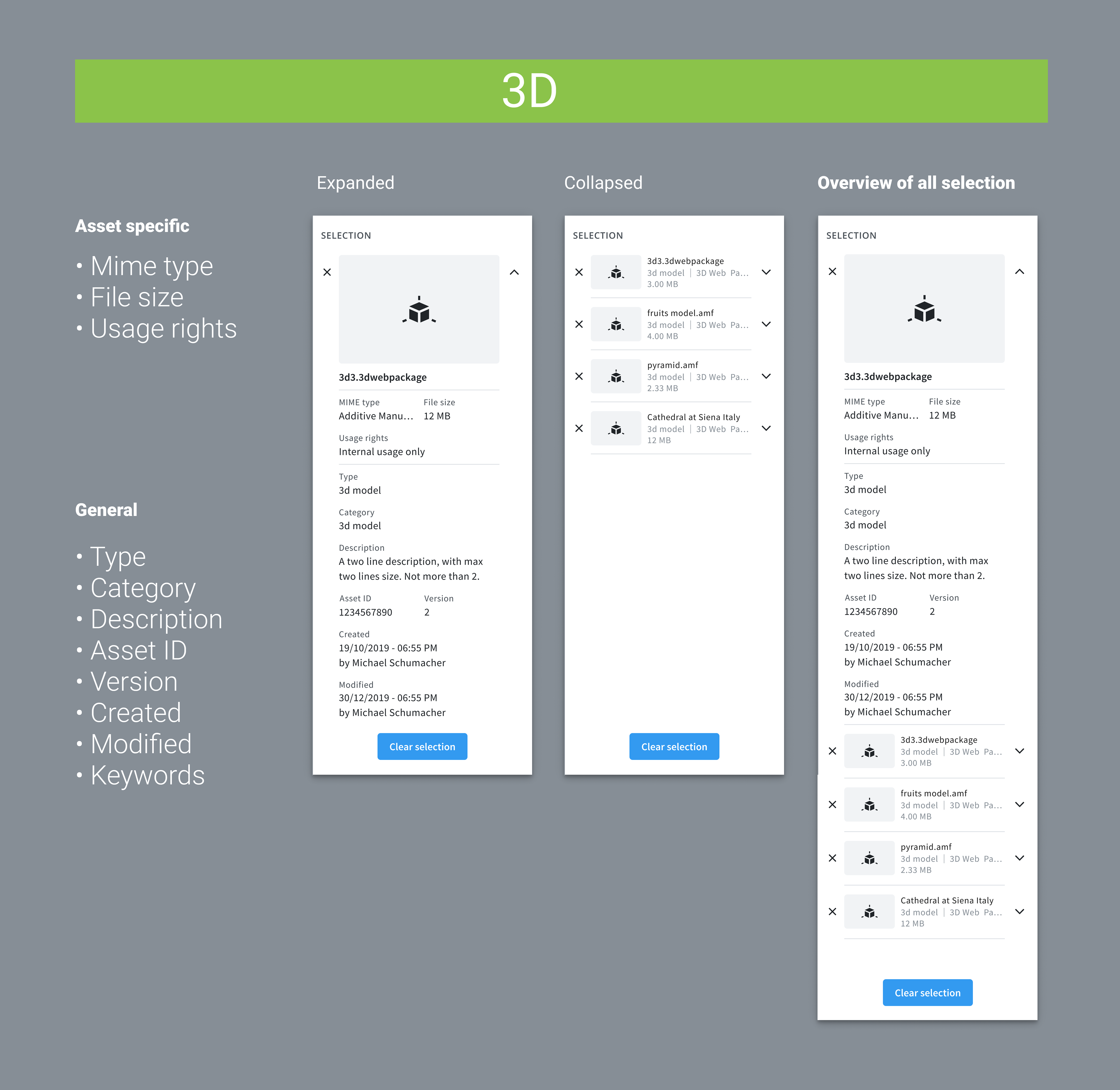
Selection data for 3D
Card view
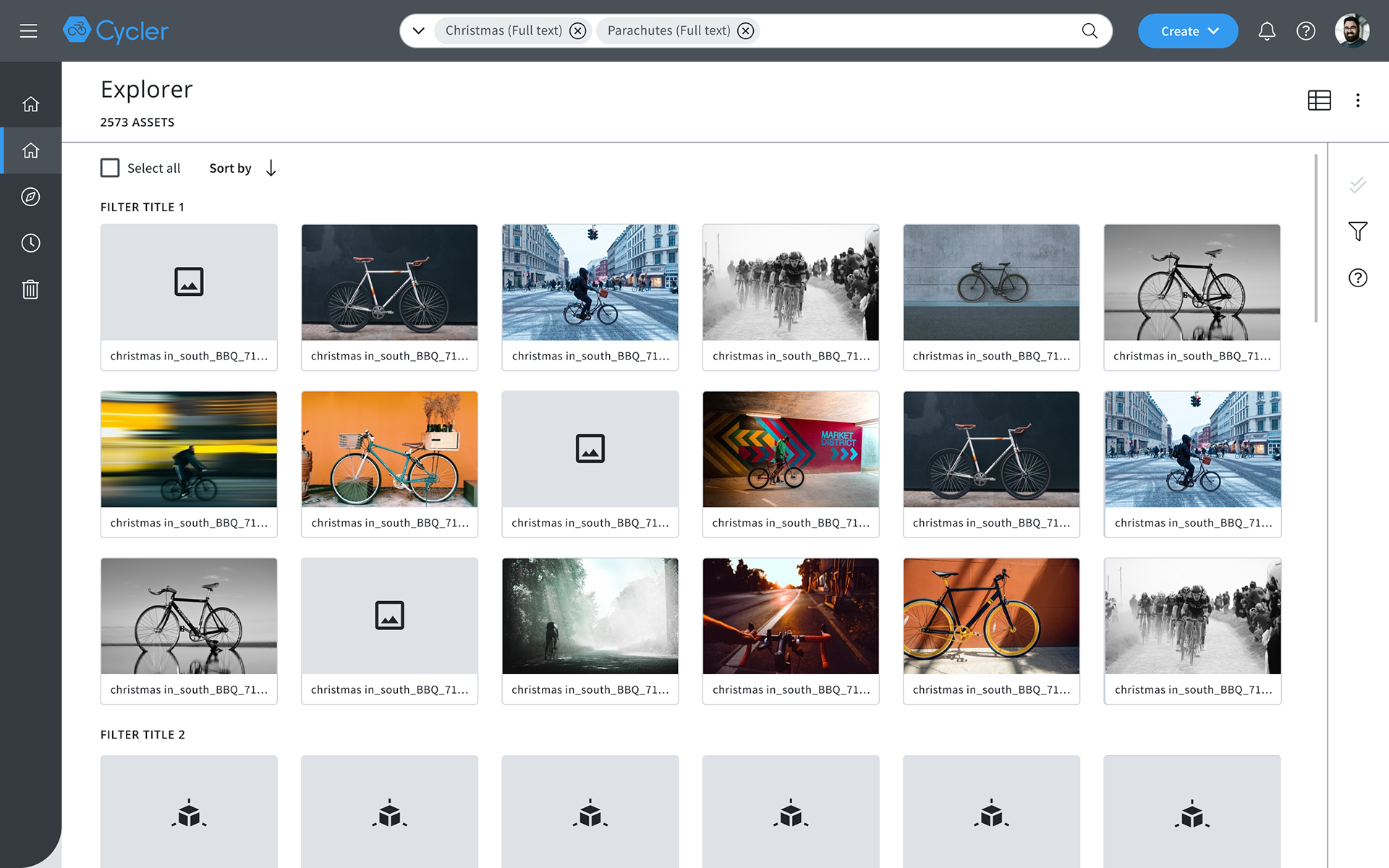
Card view
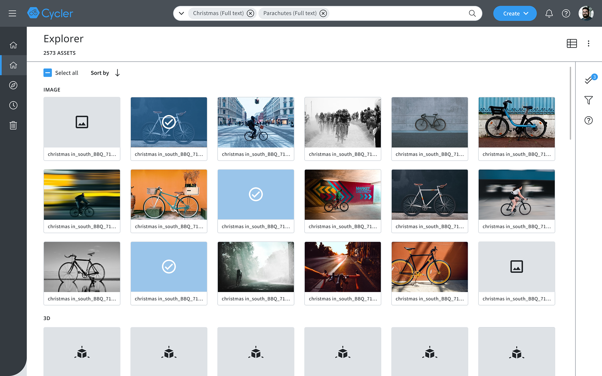
Card view with selection
Auto suggestion
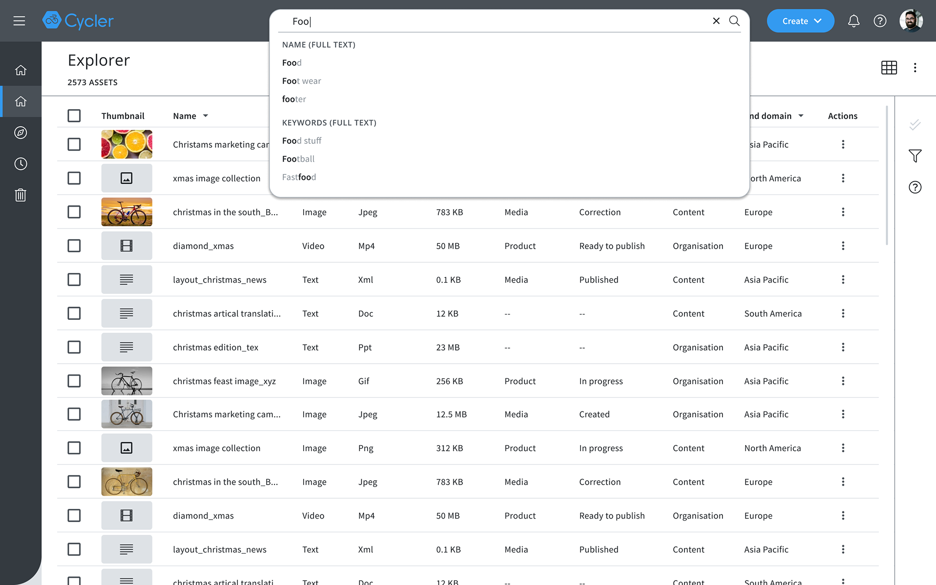
Auto suggestion with few suggestion
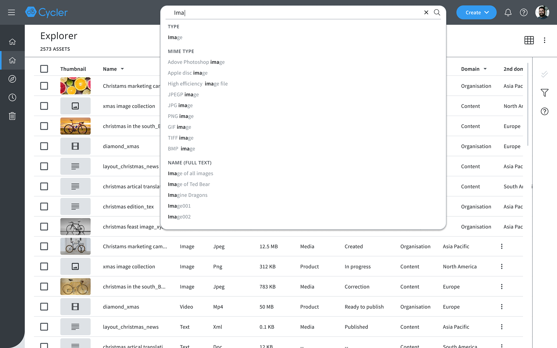
Max height for search suggestion
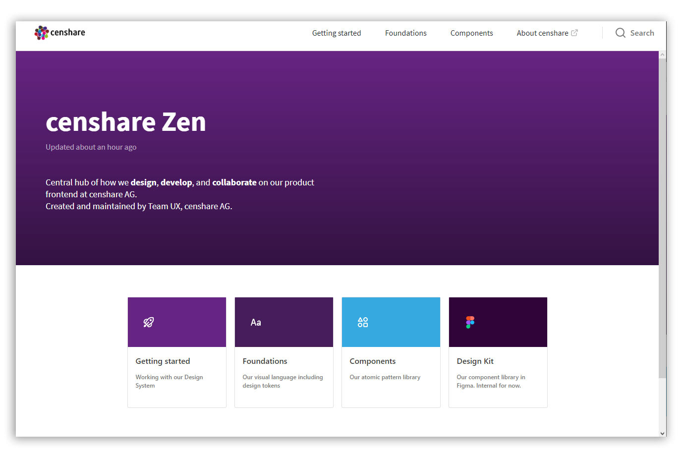
Zen - The new Design System
After designing new components for the library and organised into a Figma file, I published all the changes into our Design Library, you can check it here.