Designing a rapid review application that fits the on-the-go workflow of SIXT employees
The Challenge of the Busy Reviewer
Imagine being Alex, a SIXT manager constantly on the move at a busy airport, or Regina, a customer service agent juggling dozens of calls a day. Now, add a new task: manually reviewing dozens of car rental offers. For these key employees, time is a luxury and efficiency is a necessity. They need a tool that works for them—not one that adds to their workload.
The Problem Statement from a Business Perspective:
As SIXT launches its new "Ride my Auto" community platform, a manual review process is essential to maintain quality. However, our pilot team consists of employees with demanding schedules and diverse tech comfort levels. The challenge is to design a back-office application that is so fast, intuitive, and adaptable that it allows these busy team members to seamlessly fit the review task into their already packed days, ensuring a smooth and scalable launch of our new business line.
The Problem Statement from the User Perspective:
Alex, Regina, and Jean are all part of the team tasked with reviewing car offers for SIXT’s new "Ride my Auto" platform. But they have different daily routines, tech savviness, and work environments. The problem is that a one-size-fits-all solution won't work. The back-office tool needs to be designed with their unique needs in mind, allowing them to complete reviews quickly and clearly, whether they are on the go, at their desk, or new to enterprise software. The goal is to make their review process as effortless as possible.
Design process
Understanding Our Users' unique needs and work habits
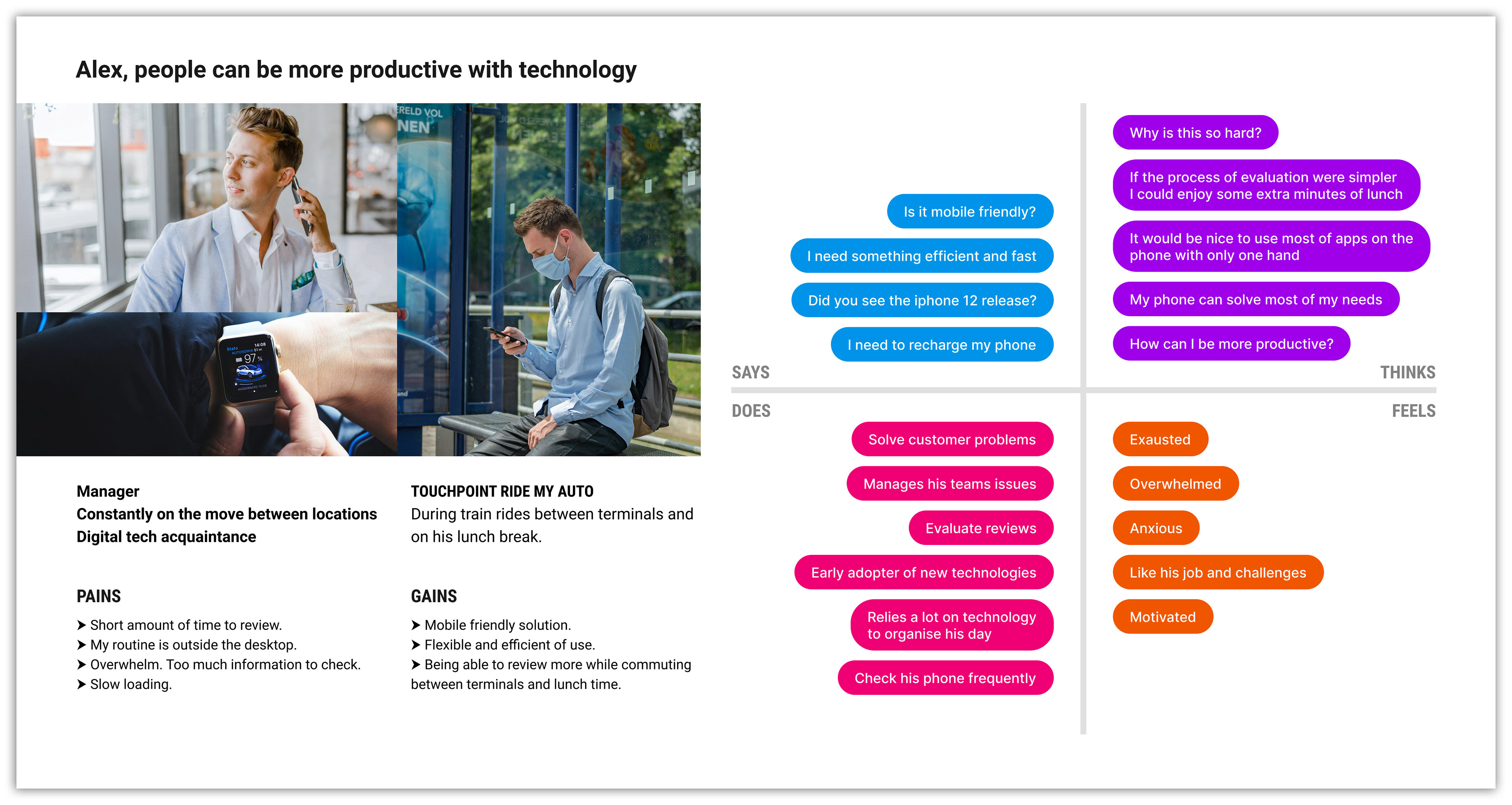
To build a successful and intuitive tool, our first step was to empathize with our users.
This involved a comprehensive user analysis to map out their specific pains, gains, and key touchpoints, giving a clear picture of their challenges and motivations. We then created a detailed empathy map for each persona, which captured their thoughts, feelings, sayings, and actions. This rigorous process provided the crucial insights that shaped our entire design approach, ensuring the final application was tailored to their diverse needs.
Alex, the On-the-Go Manager:
Alex is a busy branch manager at London Heathrow Airport who is constantly moving. He needs a solution he can use on his smartphone or tablet during short breaks, like on a train or during lunch. He is tech-savvy and accustomed to using mobile devices for work.
Alex is a busy branch manager at London Heathrow Airport who is constantly moving. He needs a solution he can use on his smartphone or tablet during short breaks, like on a train or during lunch. He is tech-savvy and accustomed to using mobile devices for work.
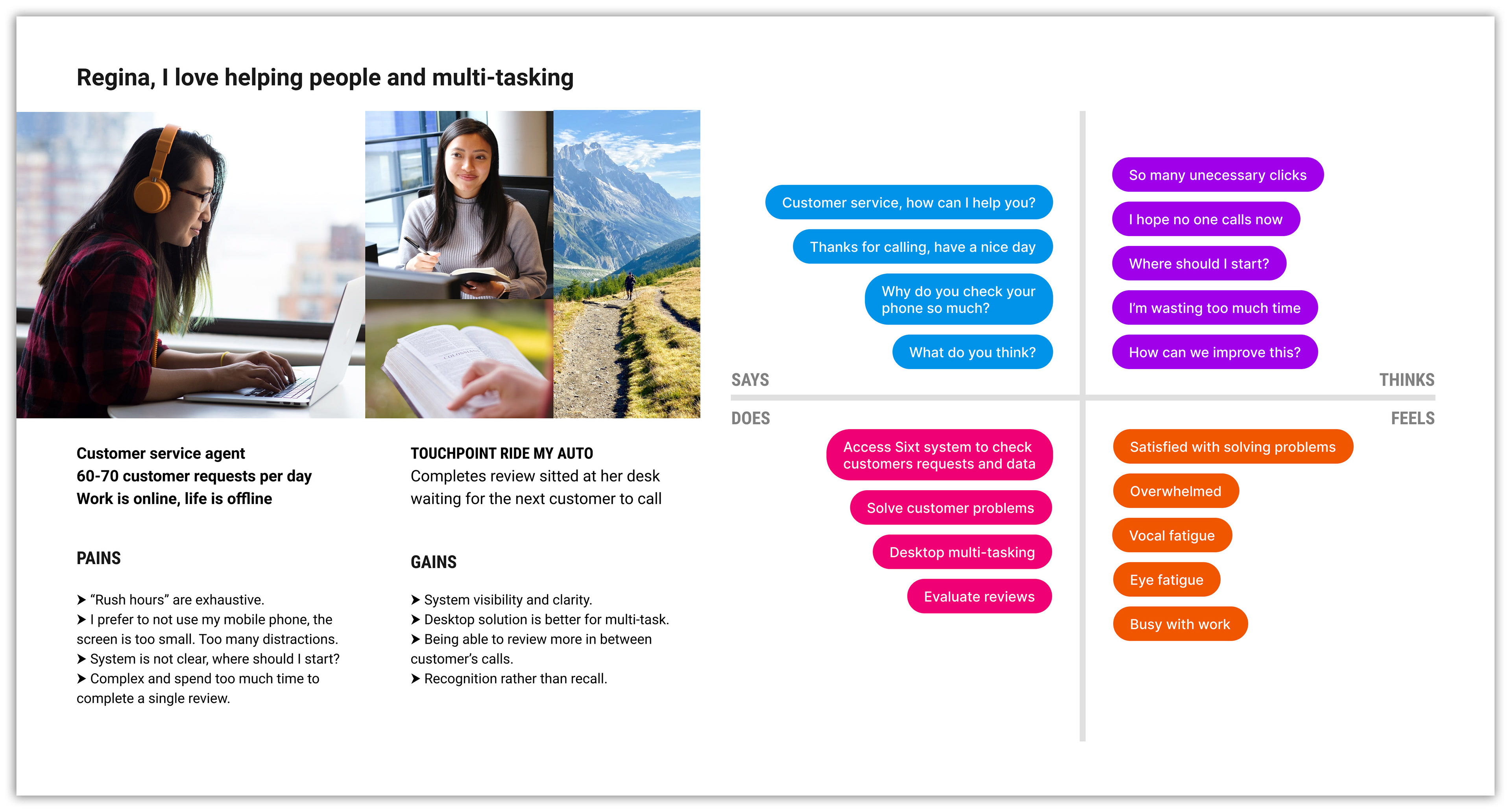
Regina, the Desk-Based Agent:
Regina is a customer service agent in a call center. She reviews car offers at her desk in between customer calls. Unlike Alex, she is not interested in using mobile devices for work and needs a tool that is easy to use on a desktop computer. She values a clear, straightforward interface that doesn't add to her screen time.
Regina is a customer service agent in a call center. She reviews car offers at her desk in between customer calls. Unlike Alex, she is not interested in using mobile devices for work and needs a tool that is easy to use on a desktop computer. She values a clear, straightforward interface that doesn't add to her screen time.
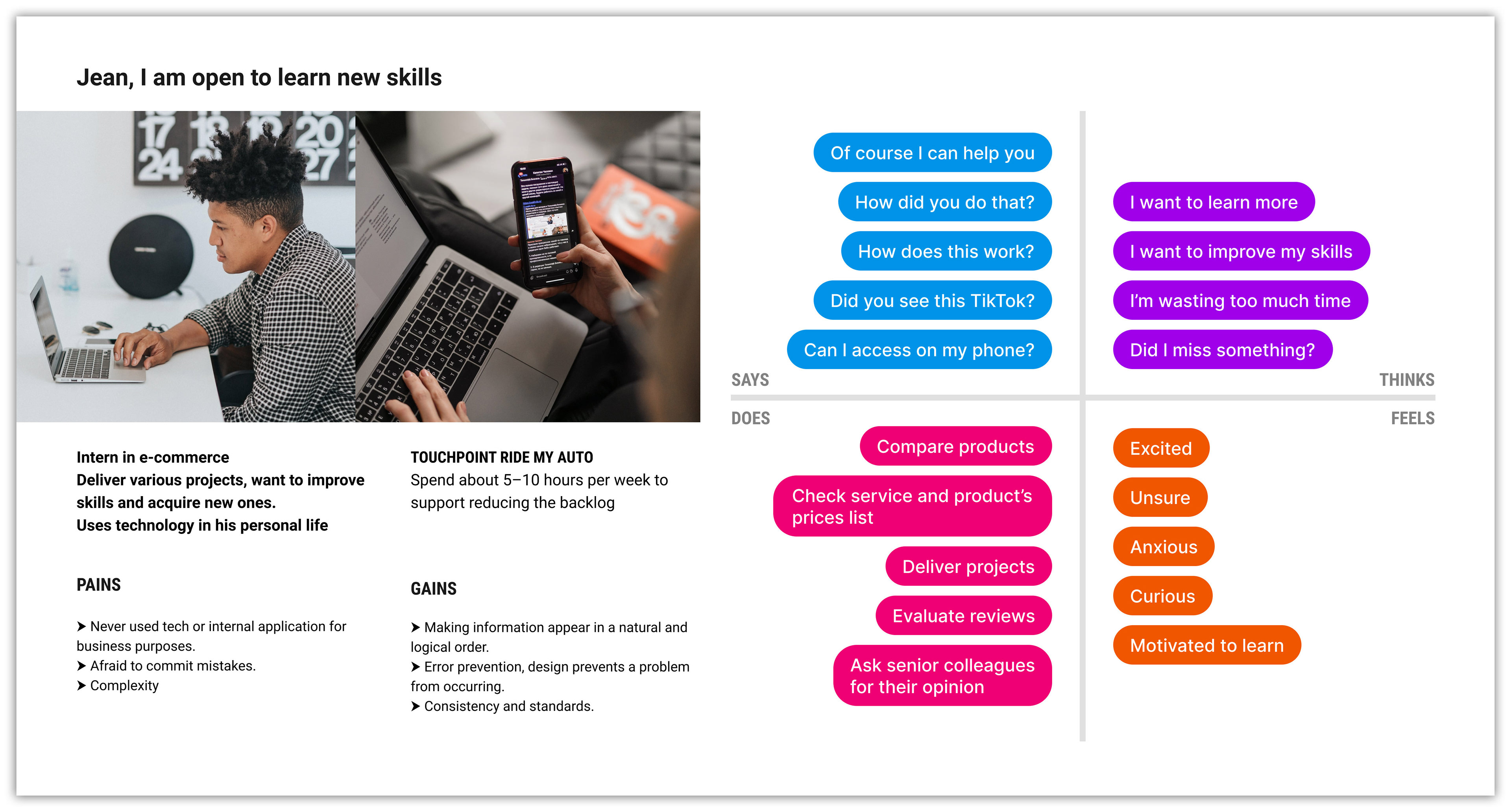
Jean, the Tech-Savvy Intern:
Jean is an e-commerce intern who is comfortable with personal technology and social media. However, this is his first professional experience with an internal business application. He will be reviewing offers on a desktop at the SIXT headquarters, but his inexperience with business software means the tool must be intuitive and easy to learn.
Jean is an e-commerce intern who is comfortable with personal technology and social media. However, this is his first professional experience with an internal business application. He will be reviewing offers on a desktop at the SIXT headquarters, but his inexperience with business software means the tool must be intuitive and easy to learn.
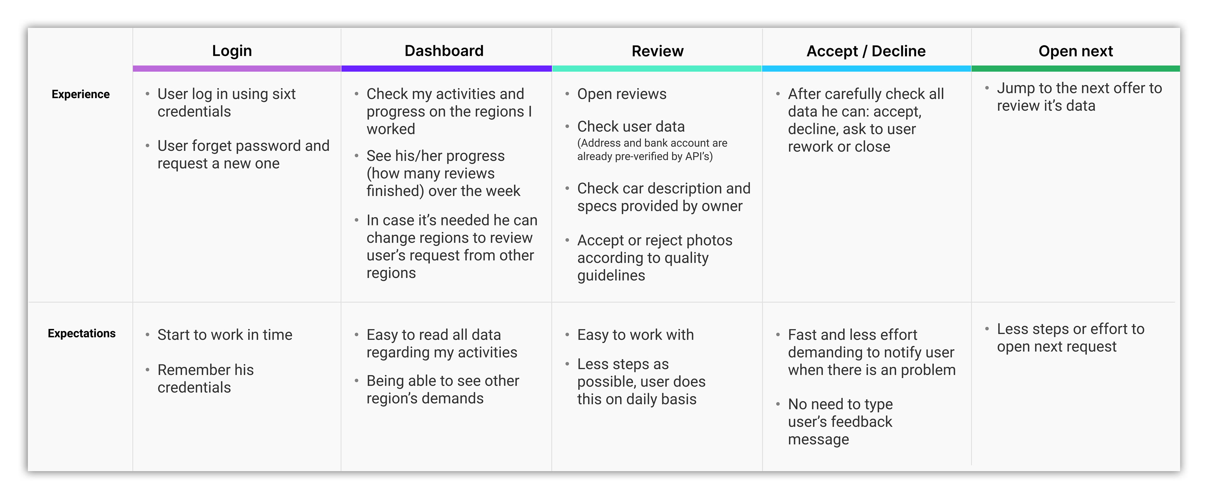
Following our user analysis, I drafted a user journey map to visualize and clarify the entire car analysis process.
This map allowed me to compare the user's experience against their expectations at each step of their daily routine. It also served as a critical tool for setting the product manager's expectations for the Minimum Viable Product (MVP), ensuring we focused on the most essential features for the back office design. As the project evolves, we can create more detailed user journeys to explore other scenarios and specific touchpoints.
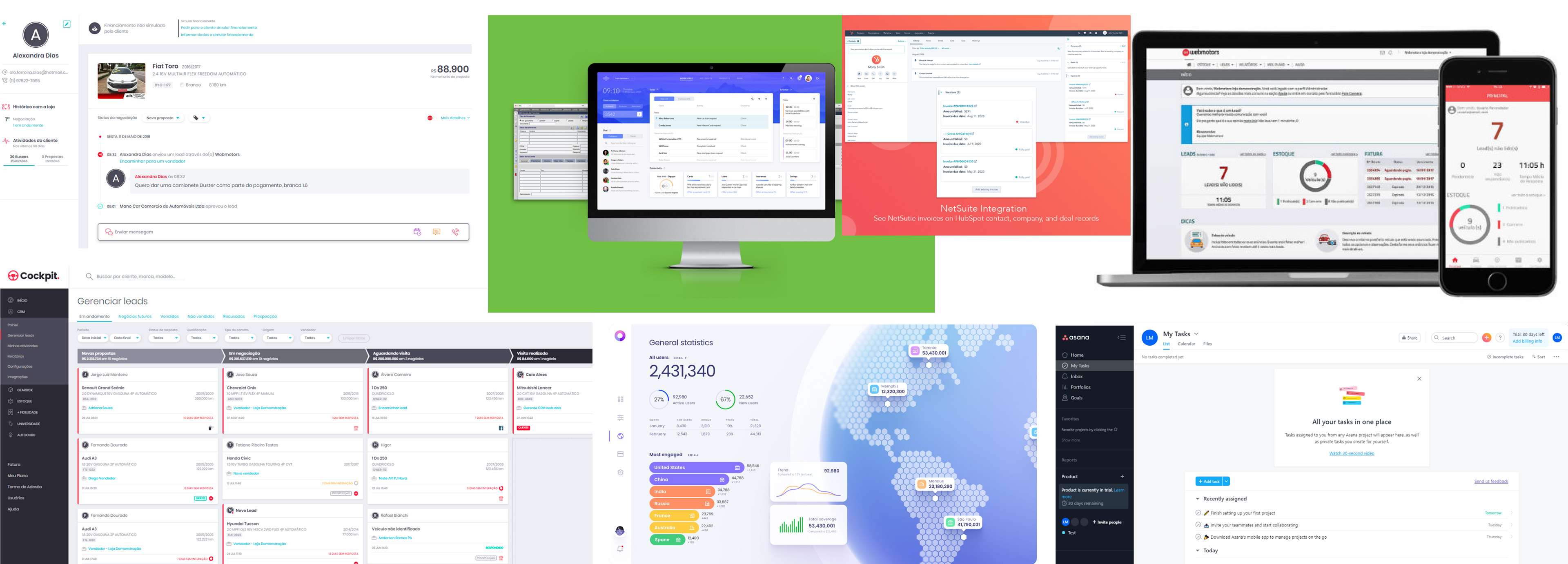
Industry Benchmarking
Leveraging my prior experience with back-office systems, I conducted a quick analysis of existing back-office tools. The goal was to gain a broad understanding of how these systems are structured and optimized to meet user needs. This analysis helped identify best practices and revealed opportunities for improvement, ensuring our solution would be both efficient and innovative. I also documented key patterns and useful resources to inform our design decisions.
Wireframe & Mobile-First Design
Based on our user research, I began the ideation phase by focusing on Alex's mobile-first use case. As our most time-constrained user, his need for an efficient mobile experience was a priority.
I outlined initial concepts on paper, using insights from the empathy maps and user journey to guide the design. The goal was to quickly generate ideas that addressed the core challenges of reviewing offers while on the go. After sketching the mobile solution, I transitioned to creating desktop wireframes, ensuring a seamless experience across devices.
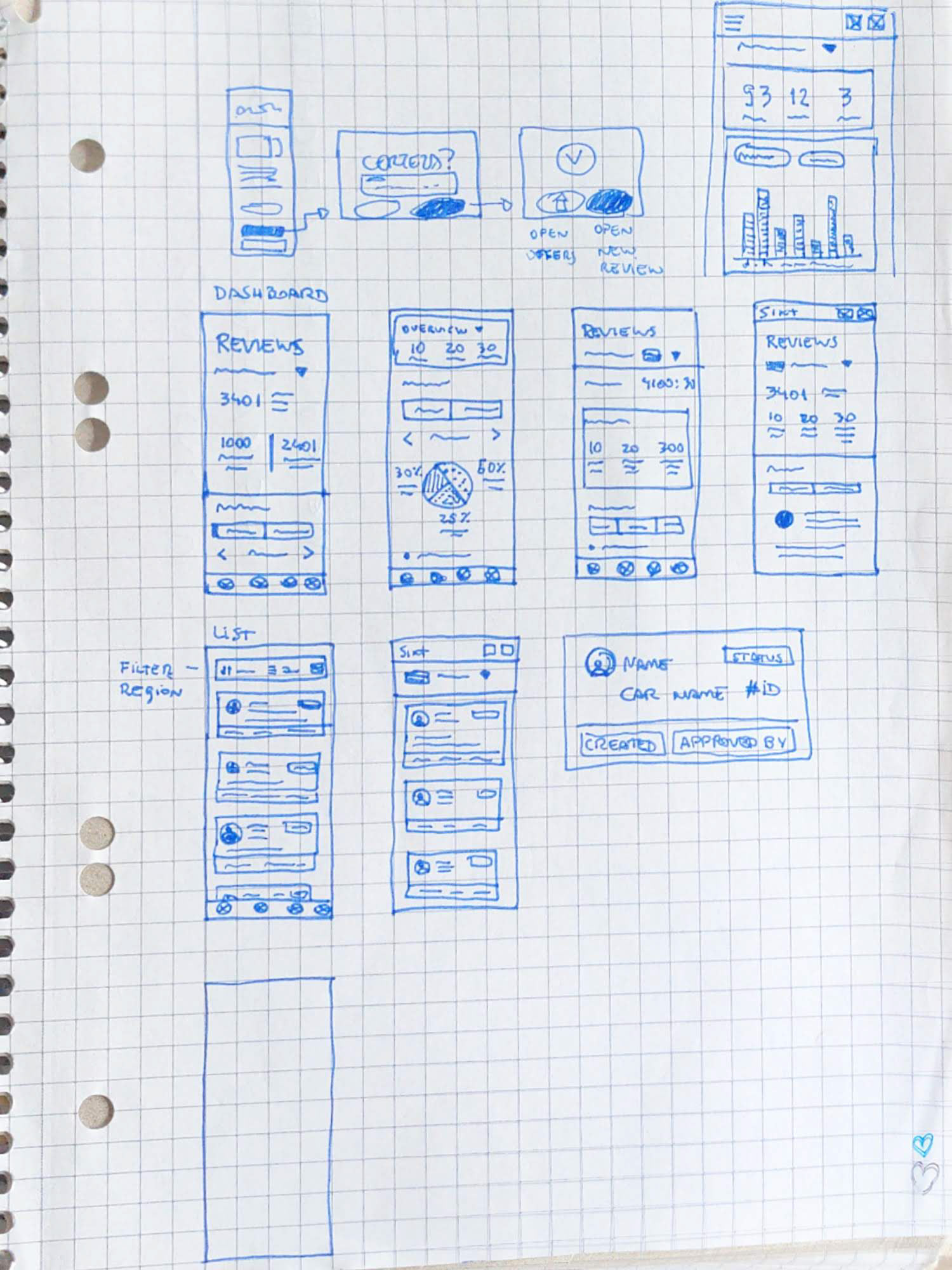
First sketches
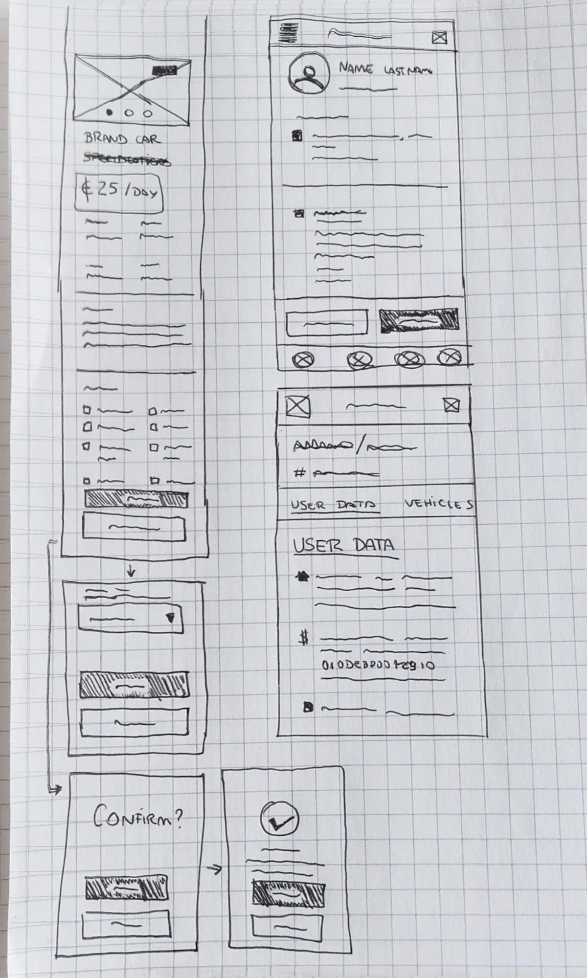
Vehicle review process
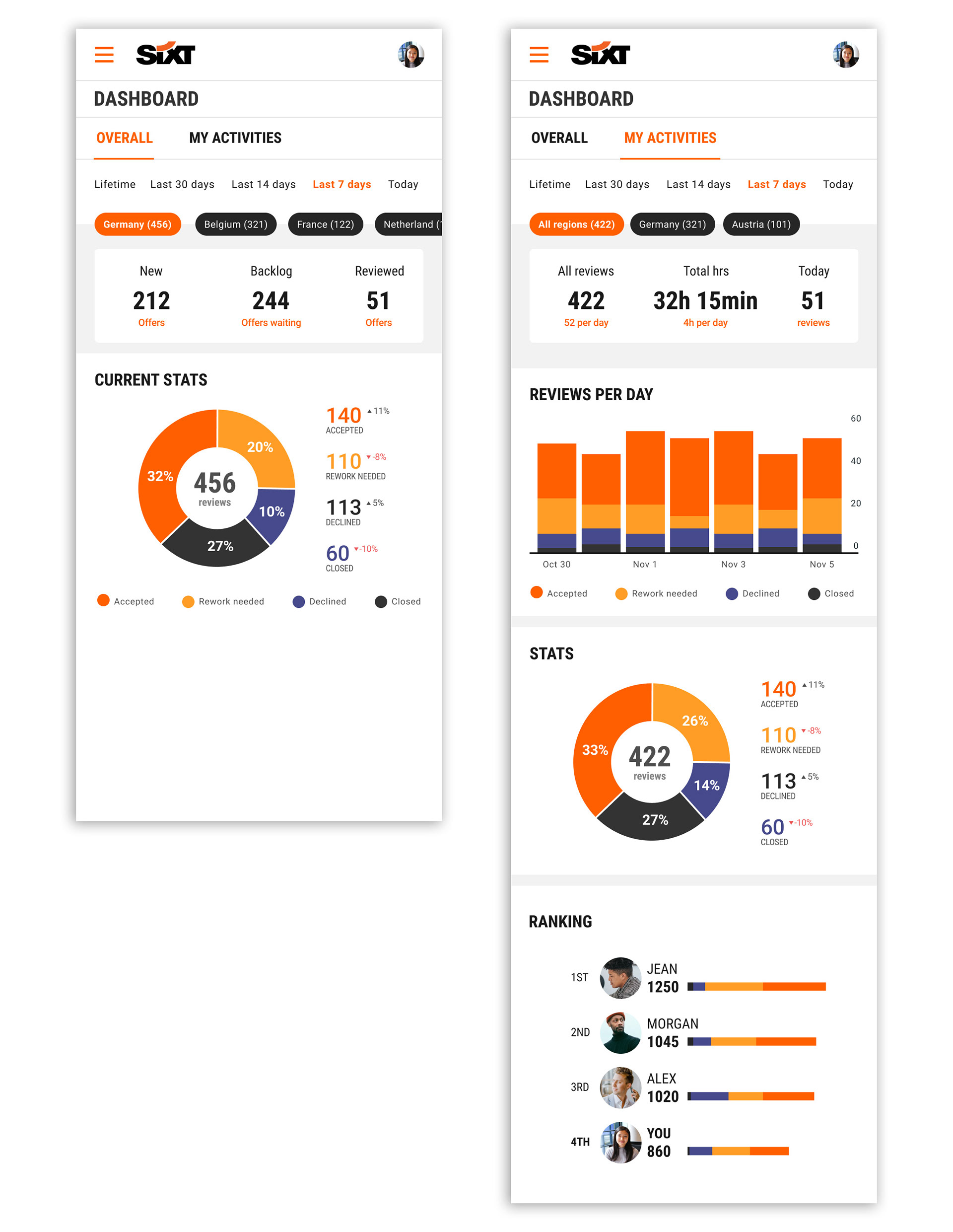
Dashboard data from all regions
WIth this data all managers will be able to know when the backlog is too big and could invite more people to work on the backlog.
Wire-framing
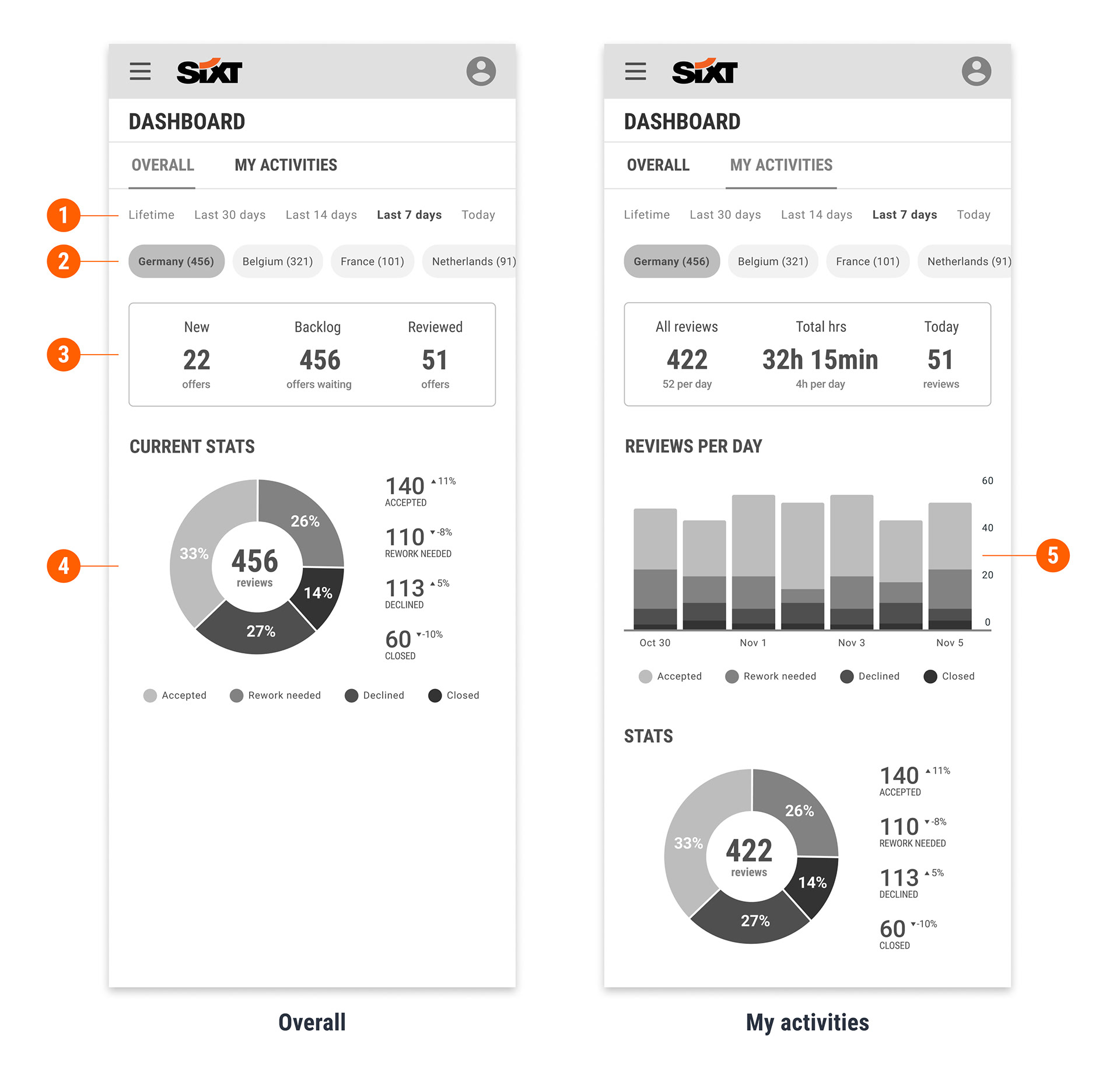
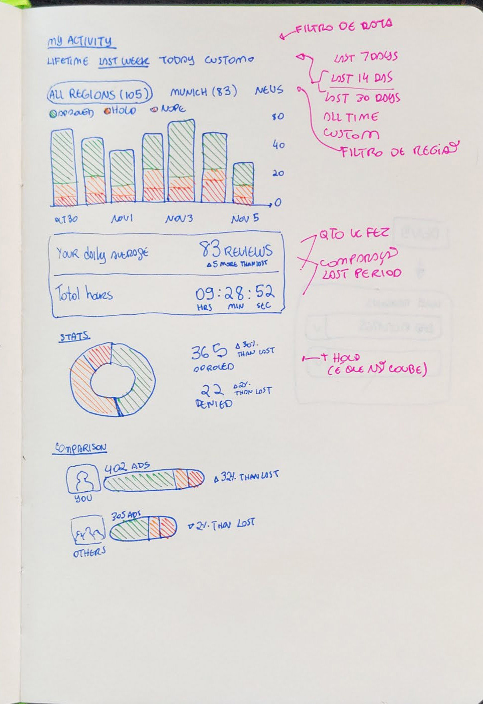
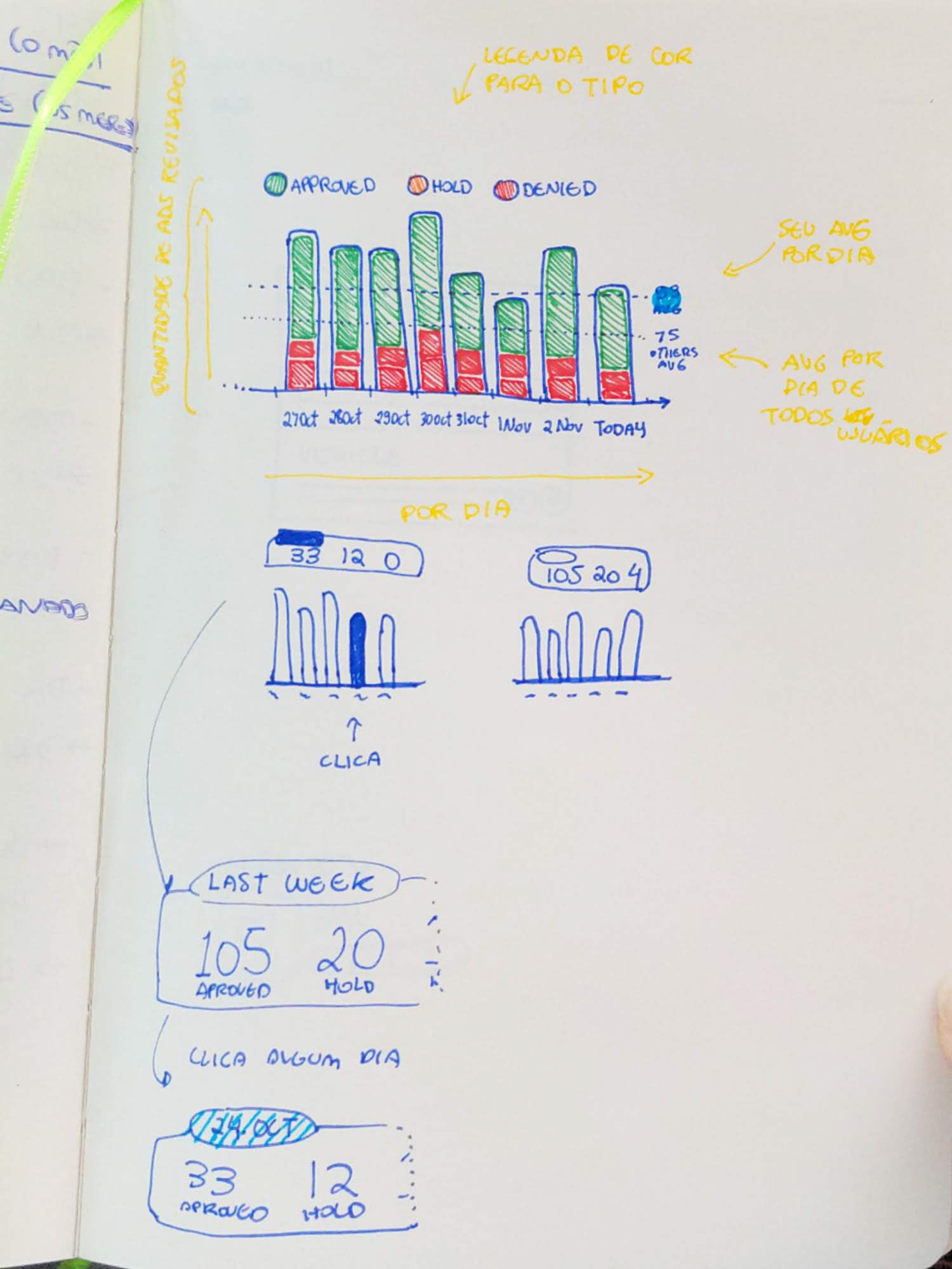
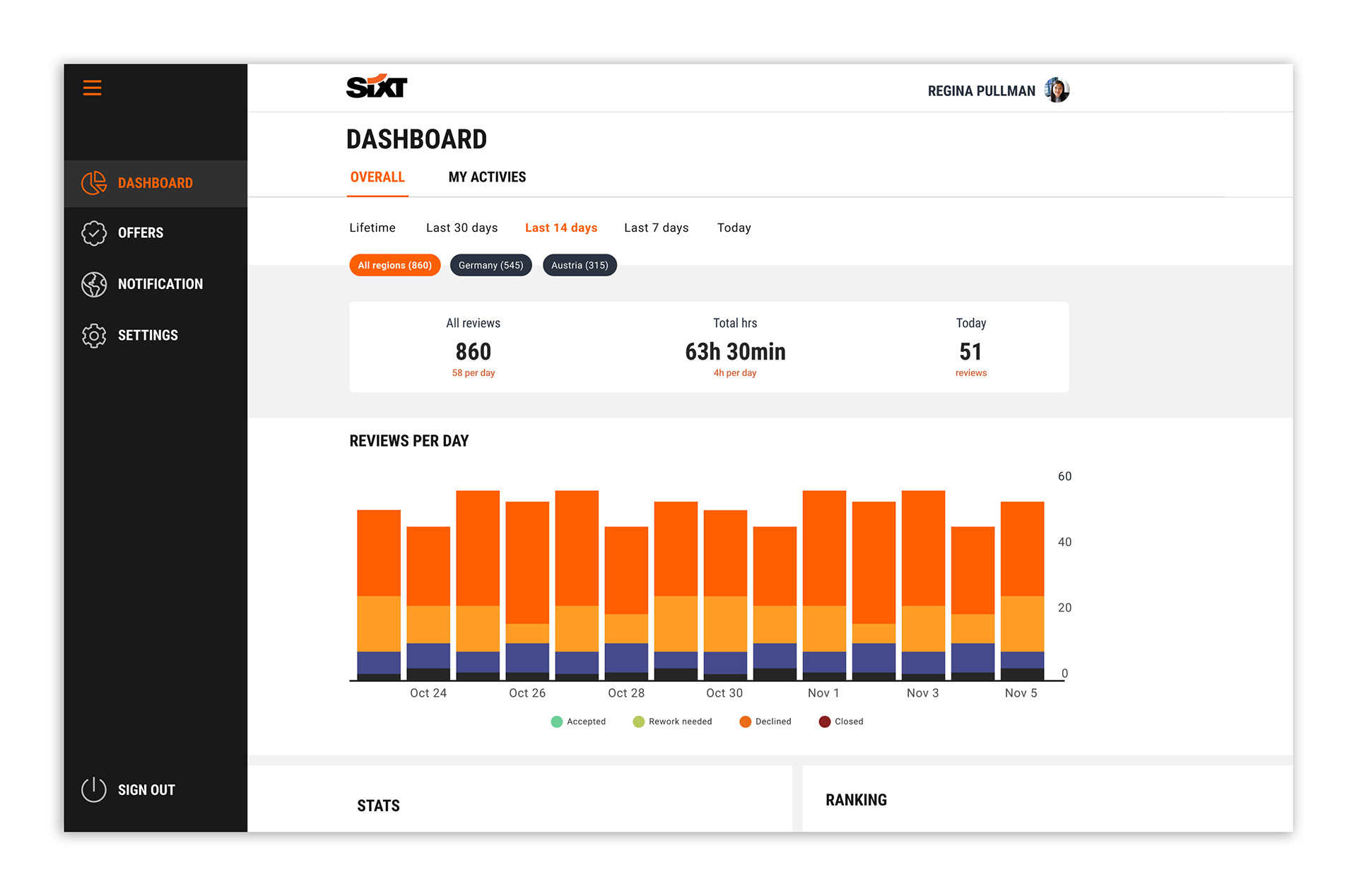
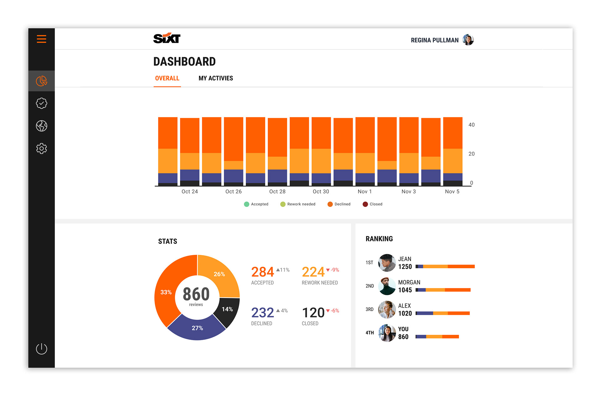
Centralized Task & Performance Dashboard
The dashboard was designed to be the central hub for our users, enabling them to prioritize tasks and maximize efficiency. Its key features include:
1. Prioritized Workload: Users can easily filter offers by region and time, allowing them to focus on the markets that need the most immediate attention.
2. Backlog Visibility: A clear overview of the number of offers in each region's backlog helps users and managers identify where to allocate resources.
3. Team Performance Metrics: Regional performance indicators allow managers to monitor the workload and reallocate resources as needed.
4. Personal Performance Tracking: Each user has access to an individual performance chart that tracks the number of offers reviewed and their status. This data helps users quantify their work and allows managers to forecast completion times.
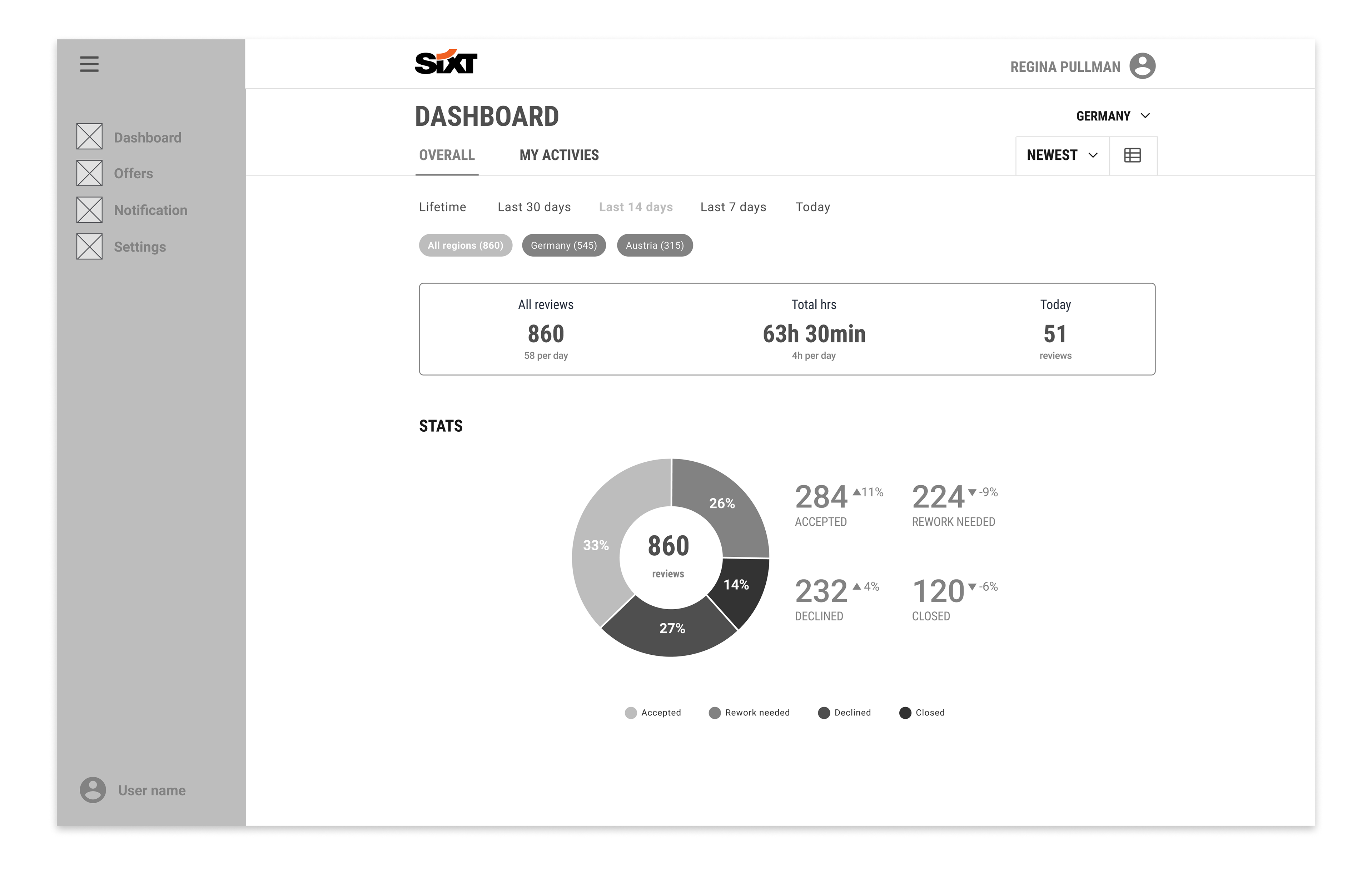
Overall data for all regions available
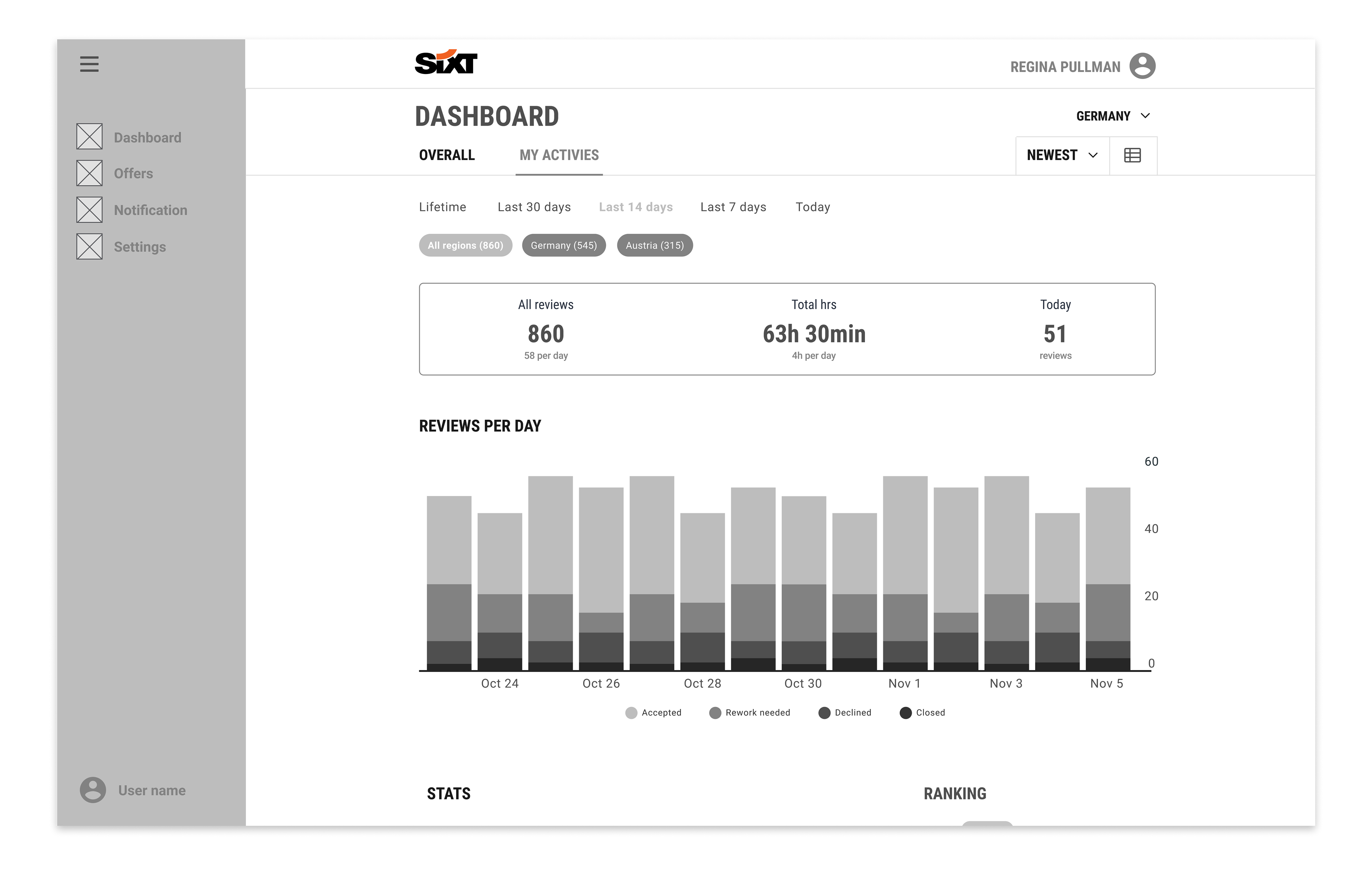
An analytical chart on the individual performance of each employee
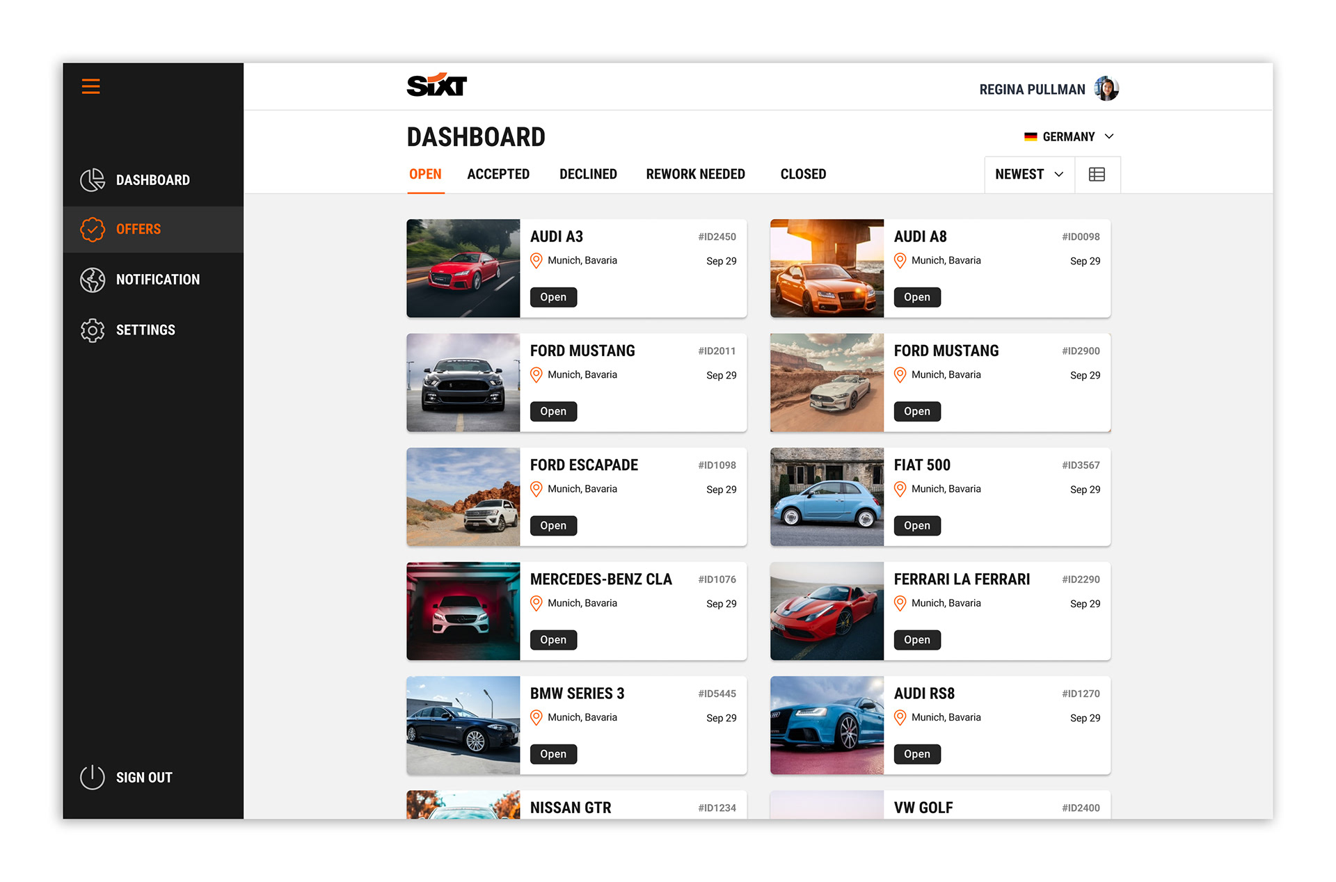
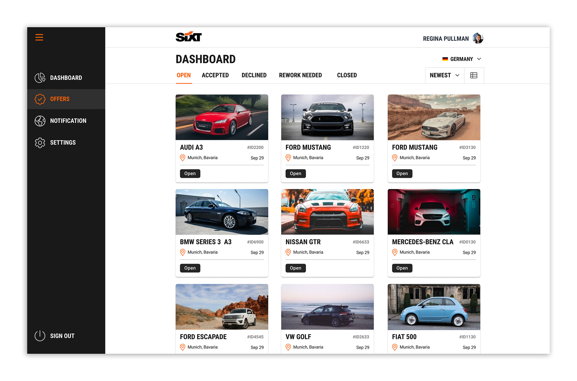
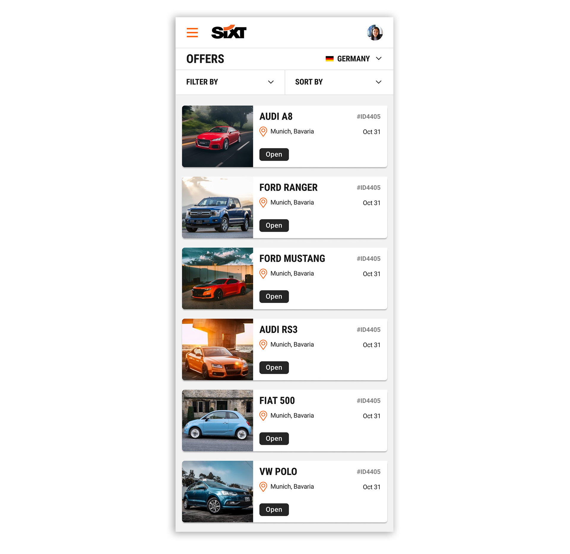
Streamlined Offer Review
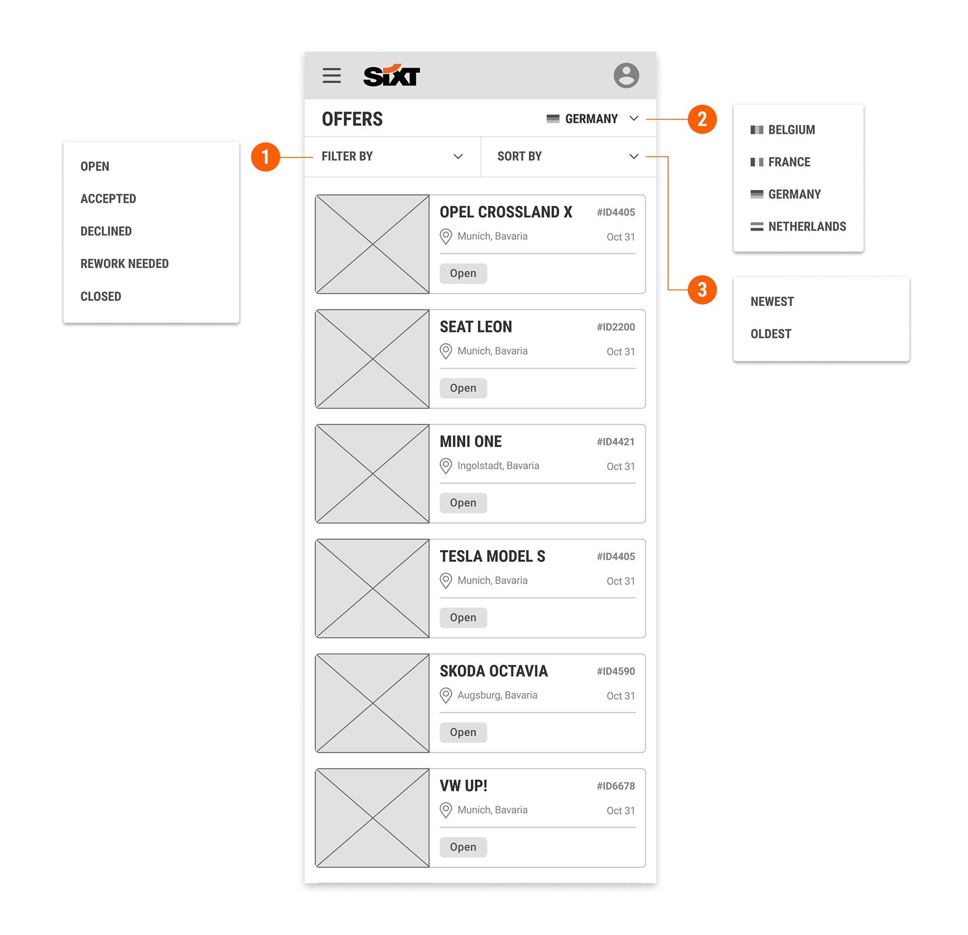
The "Offers" section was designed to give users maximum control over their workflow. This page enables quick and efficient task management through several key features:
1. Dynamic Filtering: Users can filter offers by status (e.g., Open, Accepted, Declined) to easily re-check items or focus on a specific group.
2. Marketplace Switching: The design allows users to seamlessly switch between different country marketplaces to support various points of sale as needed.
3. Sorting Options: Users can sort the backlog by newest or oldest offers, ensuring they can prioritize urgent reviews or handle pending requests that have been in the queue the longest.
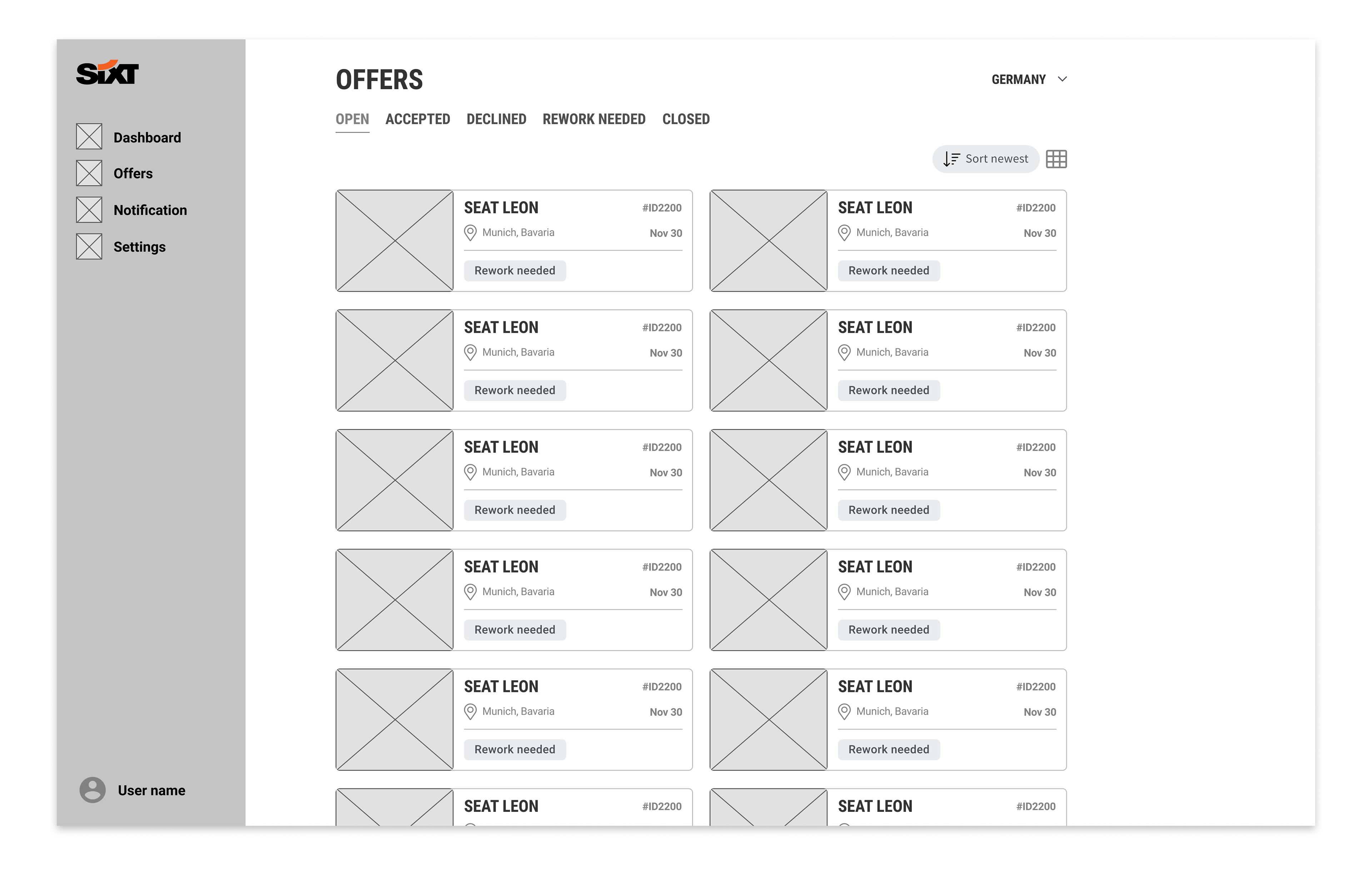
List view
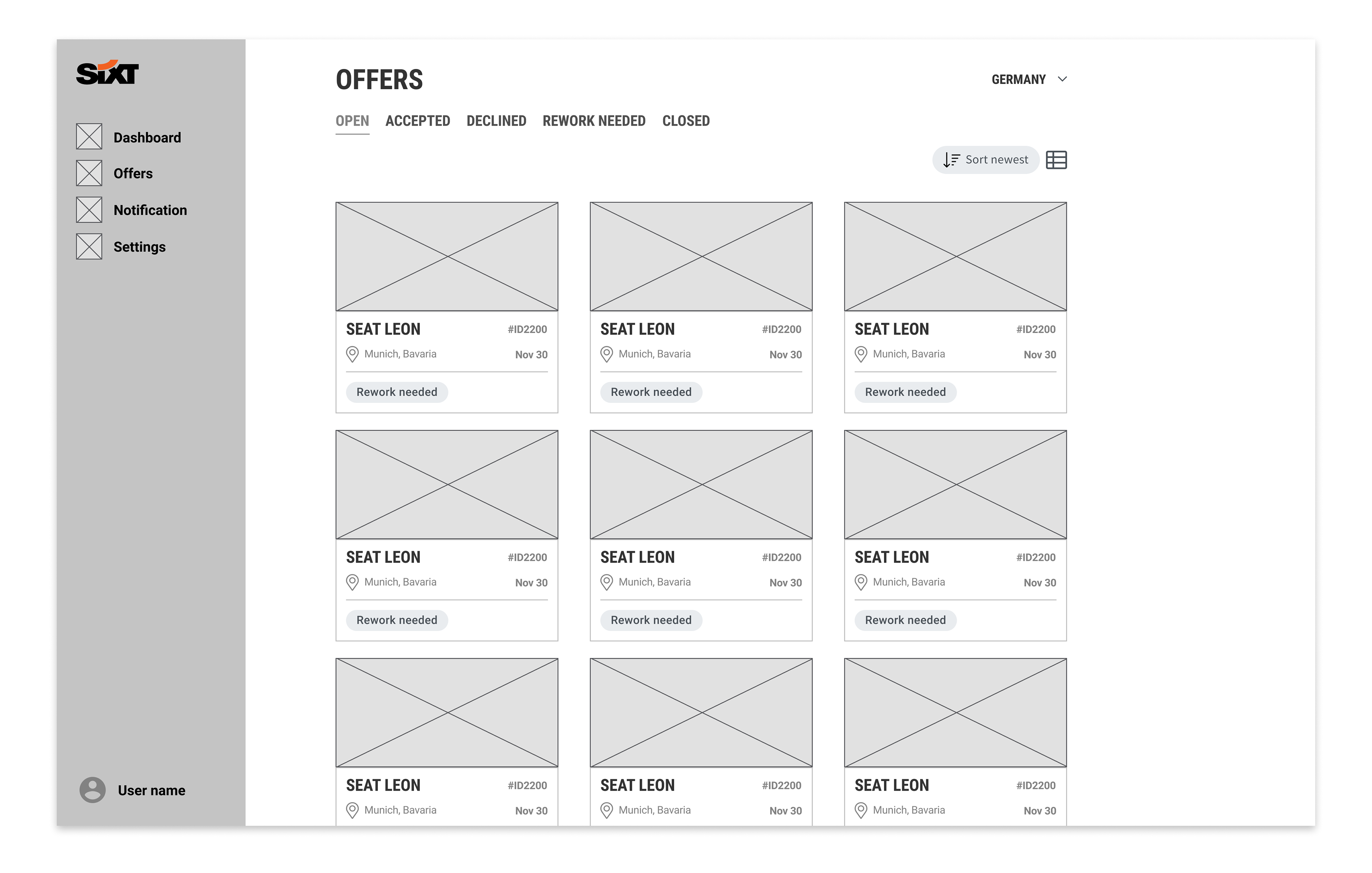
Card view
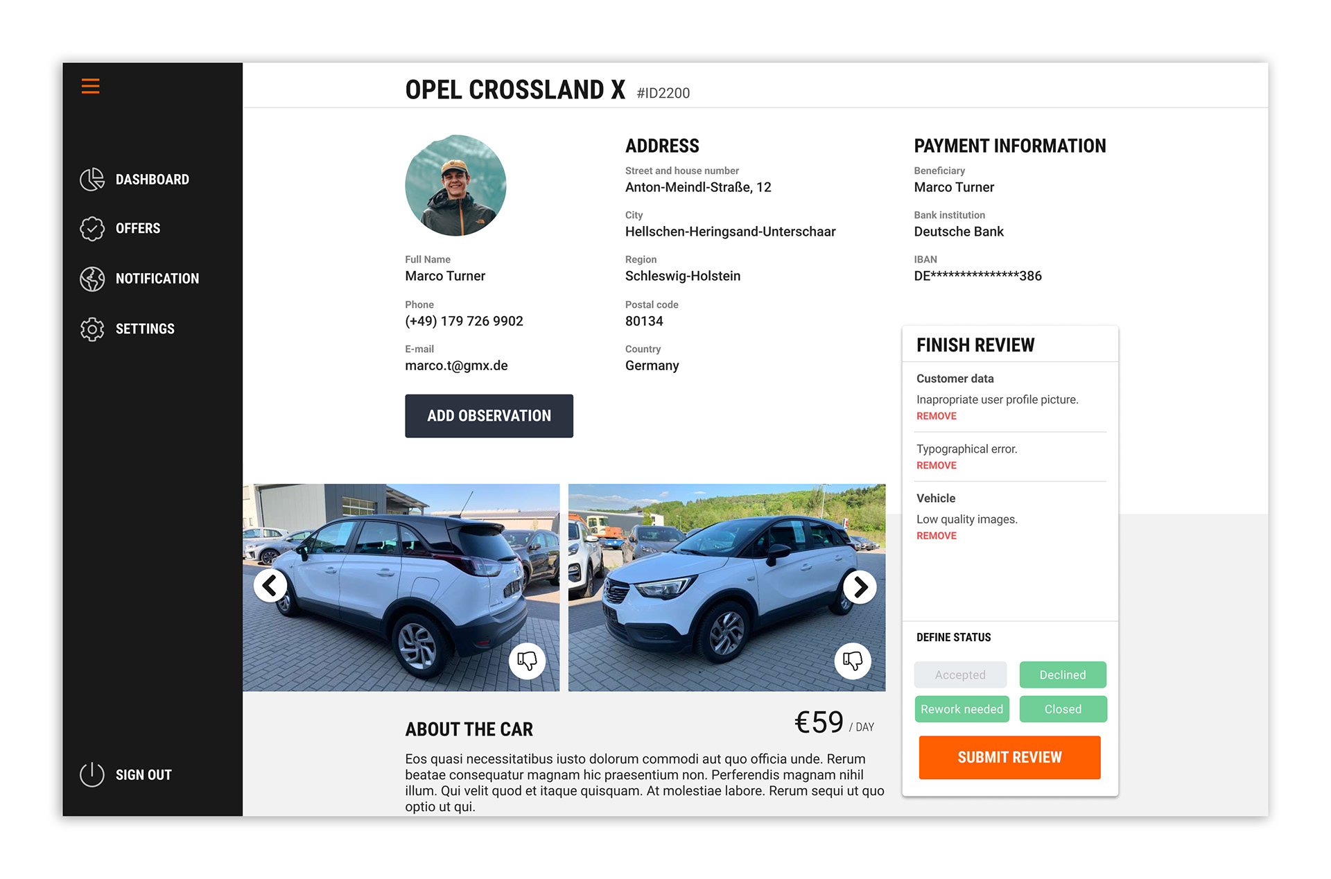
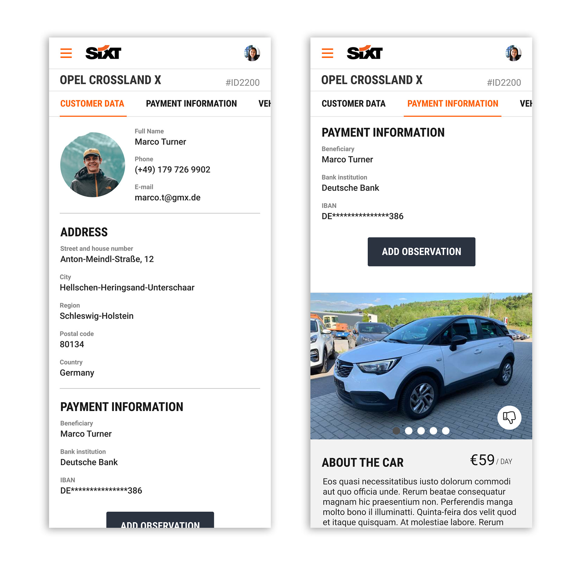
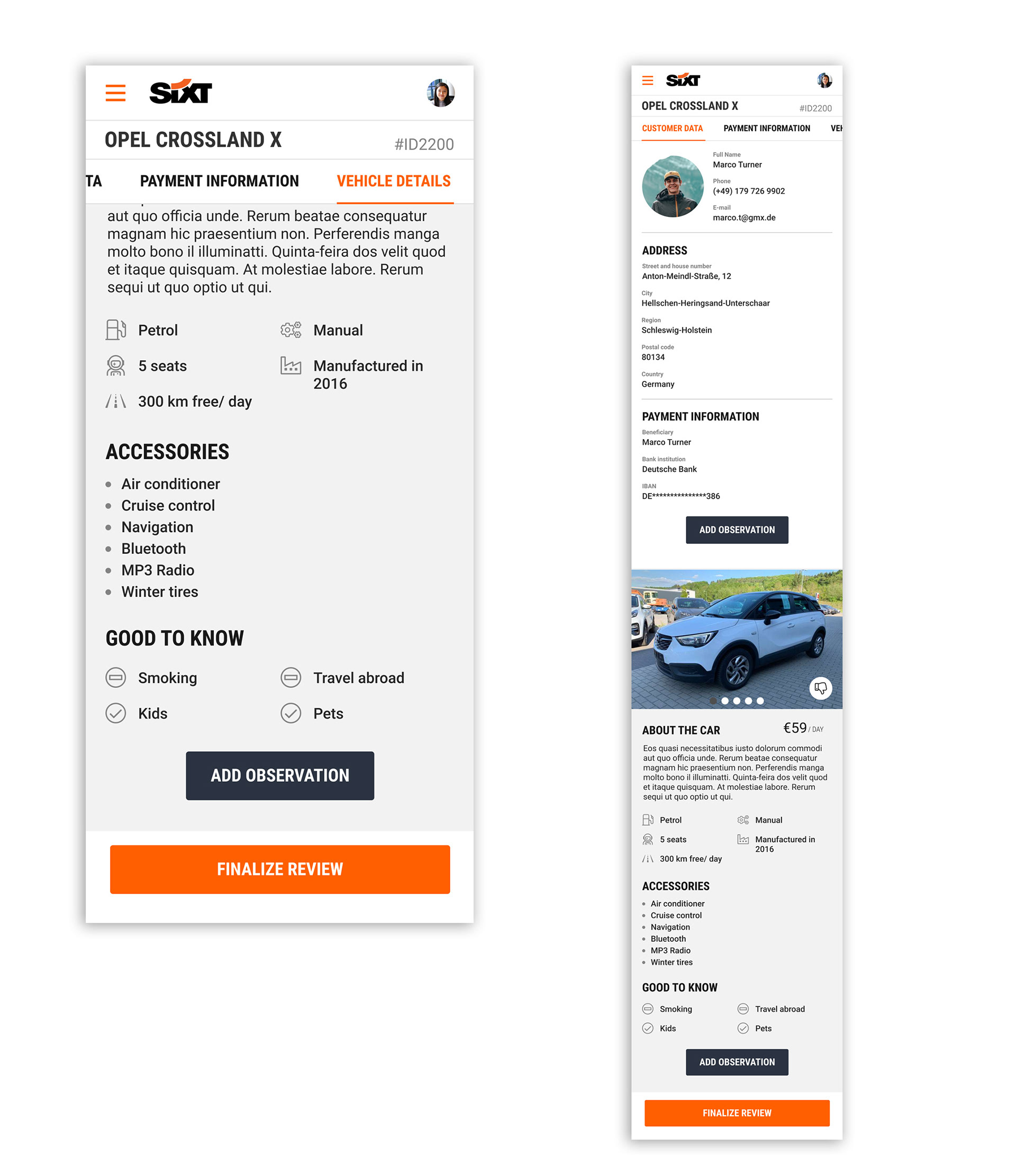
Vehicle Review Page
The vehicle review page is the most critical area of the application. The design's primary goal was to make information easily accessible and the review process as direct and error-proof as possible. It also provides a straightforward way for reviewers to justify their decisions, ensuring clear feedback for the publisher.
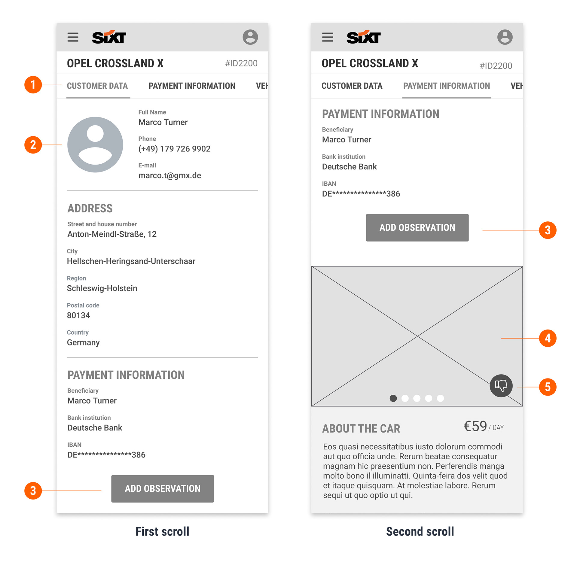
1. Fixed Navigation: Anchor links fixed at the top of the page provide a seamless navigation experience, allowing users to jump to any section instantly.
2. API-Validated Data: Publisher information is pre-checked by an API, but it still requires a final review from a SIXT employee to ensure accuracy.
3. Actionable Feedback: A dedicated call-to-action button allows reviewers to add observations. The listed reasons are directly tied to specific parts of the offer, ensuring the publisher receives precise and actionable feedback.
4. Intuitive Photo Gallery: Photos are displayed in a horizontal scroll, optimizing navigation for mobile users, especially for one-handed use.
5. One-Click Rejection: Users can disapprove a photo with a single click. A clear undo option is available to prevent accidental actions.
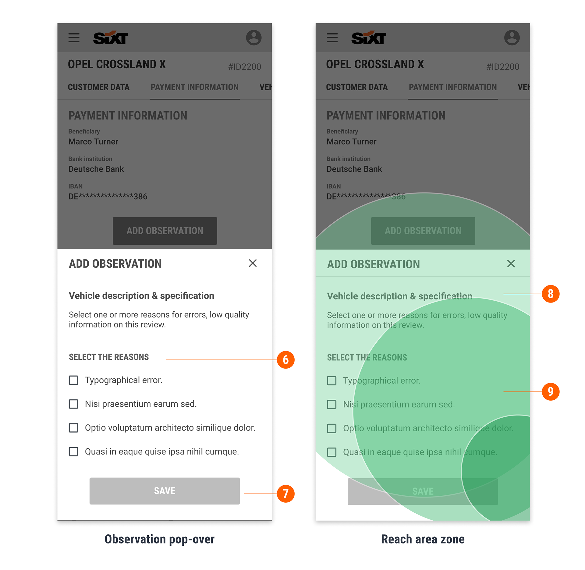
6. Efficient Feedback Loop: The reviewer can report every problem by selecting from a pre-defined list of observations. This simplifies the process and ensures the publisher receives consistent and precise feedback.
7. Error Prevention: The 'Save' button is only enabled when a reason for rejection is selected, preventing reviewers from saving an incomplete or incorrect status.
8 & 9. Optimized for One-Handed Use: Key Call-to-Action (CTA) buttons are strategically positioned within the "comfort zone" of the screen, making them easily accessible for users who are navigating with one hand. This design choice accommodates the habits of nearly half of all smartphone users.
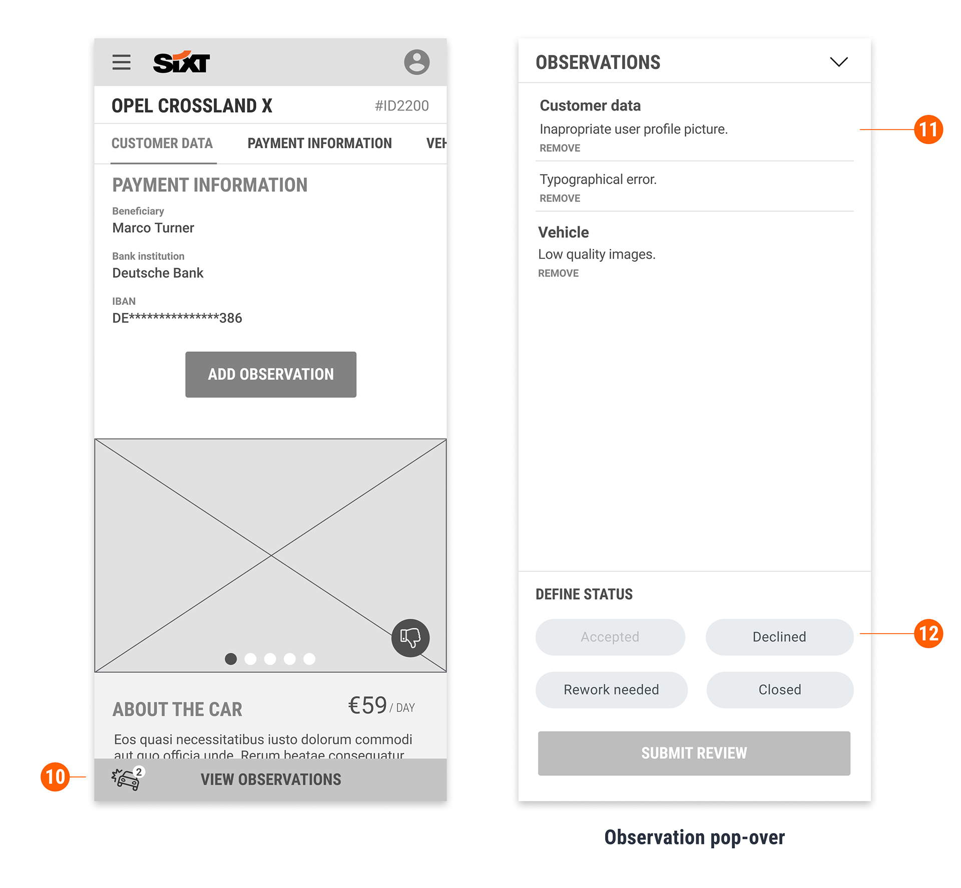
10. Persistent Feedback Summary: After a reviewer adds an observation, a fixed button appears at the bottom of the screen with a badge indicating the number of problems found. This provides a persistent and immediate summary of all detected issues.
11. Actionable Pop-Over: Tapping the button opens a pop-over displaying all listed observations. From this pop-over, the reviewer can efficiently set the offer's final status and save their changes, streamlining the workflow.
12. Status-Based Validation: The offer can be assigned one of four statuses: Accepted, Declined, Rework Needed, and Closed. To prevent errors, the "Accepted" status remains inactive if any observations have been saved, ensuring that incomplete or problematic offers cannot be approved by mistake.
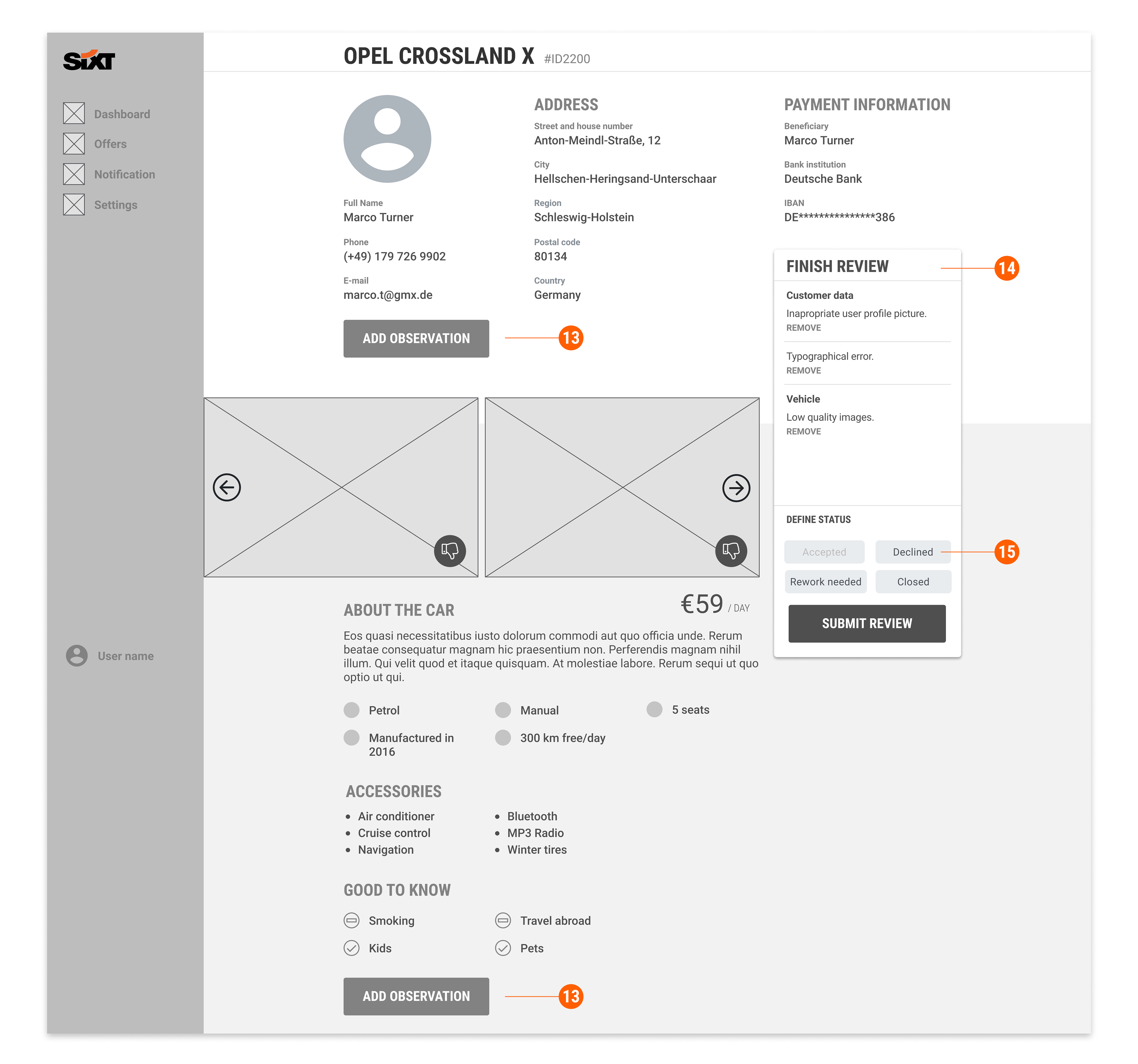
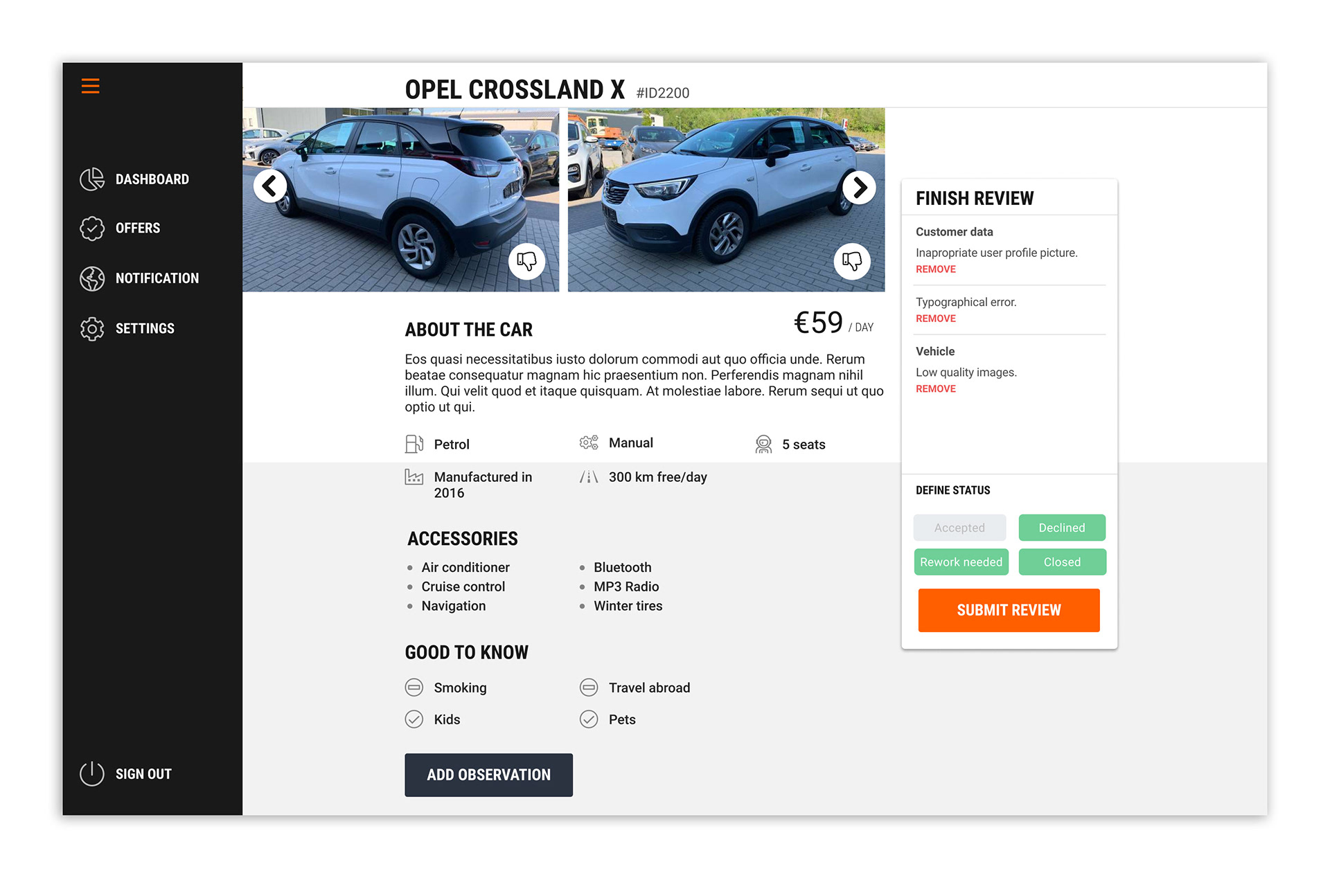
Desktop Experience: Optimizing for Interruption
The desktop version was designed with Regina in mind. Her work requires frequent interruptions, so the layout prioritizes persistent visibility. This ensures she can quickly regain context and resume her review, even after a break.
13. Contextual Observations: Each observation button is positioned next to its relevant content. This design choice helps the reviewer quickly see and add remarks for specific parts of the offer, ensuring clarity and accuracy.
14. Persistent Summary: A fixed "check-out" box provides a running summary of all observations added to the offer. This allows the reviewer to easily review and remove any remarks before finalizing the review.
15. Status-Based Validation: The offer can be assigned one of four statuses: Accepted, Declined, Rework Needed, and Closed. To prevent mistakes, the "Accepted" status is deactivated if any remarks have been saved, ensuring that problematic offers cannot be approved by mistake.
Prototyping and Usability Testing
After completing the wireframes for all key screens, I developed a low-fidelity prototype informed directly by the user journey map. This prototype served as a crucial tool for conducting usability tests.
The primary goal of these tests was to validate our proposed solutions and confirm they effectively addressed the user pain points we identified earlier. By observing users interact with the prototype, we were able to quickly gather feedback on key workflows, such as the efficiency of the review process and the clarity of the interface, ensuring our design decisions were data-driven and user-centered.
User Interface
Dashboard
Offer list
Vehicle to be reviewed